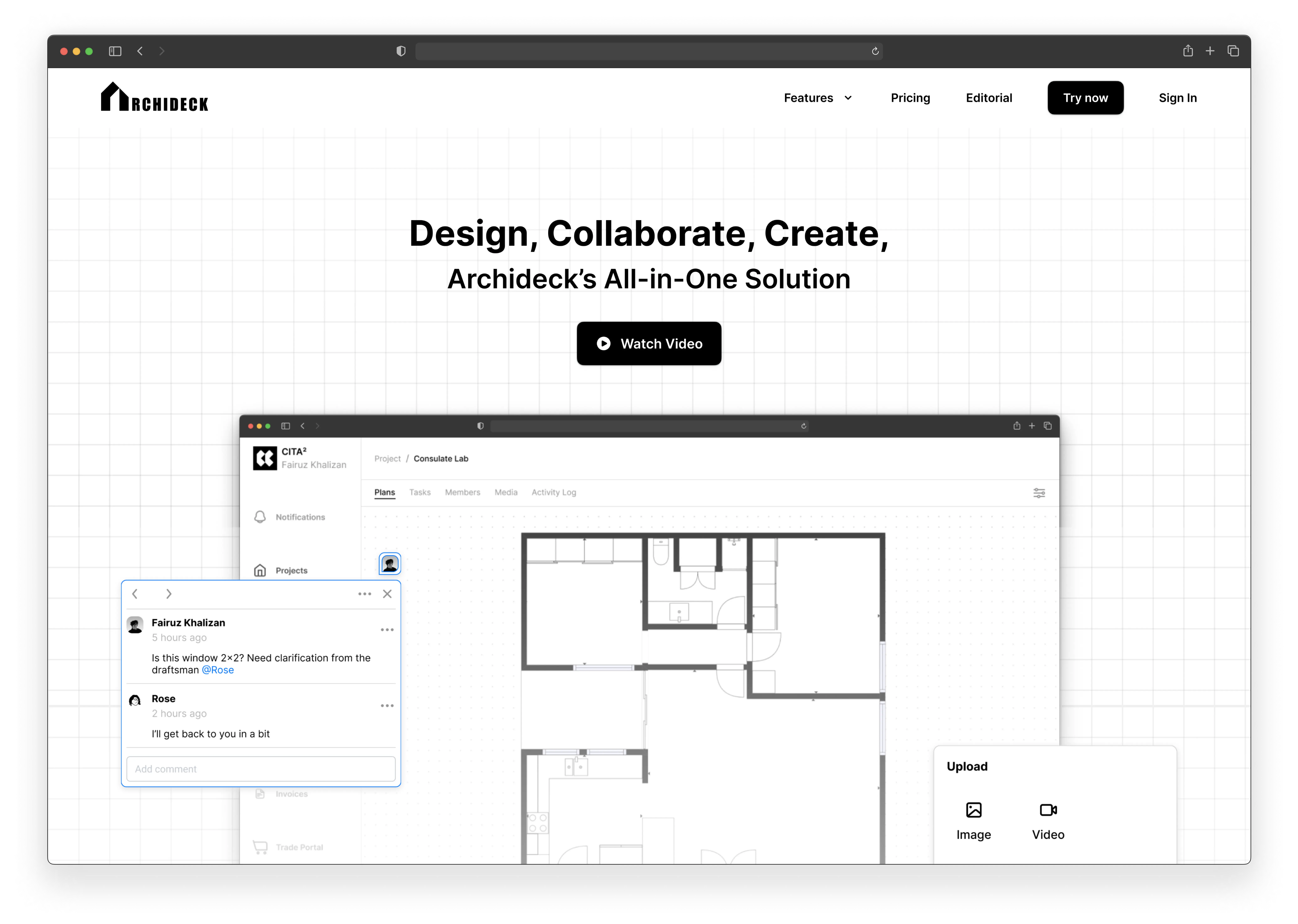
To see full case study, click link below
Project Type
Community (Discord / Reddit)
My Role
Project Designer
Timeline & Status
2 Months, Paused in December 2023
Overview
Archideck is a personal project of mine that caters to the users who are in the architecture or construction field.
It's a project management software and its primary goal is to streamline the management of a construction project and have an effective communication tool between project members and clients.
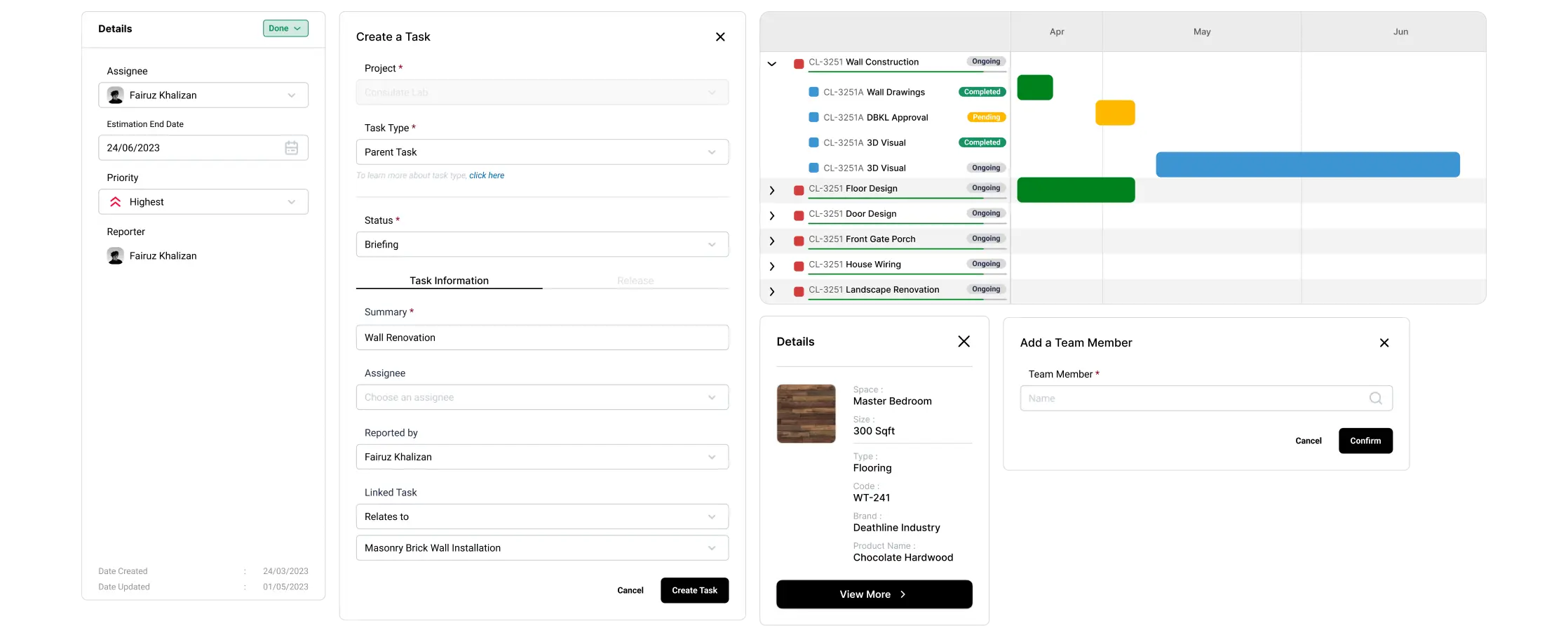
0.1 Sample UI components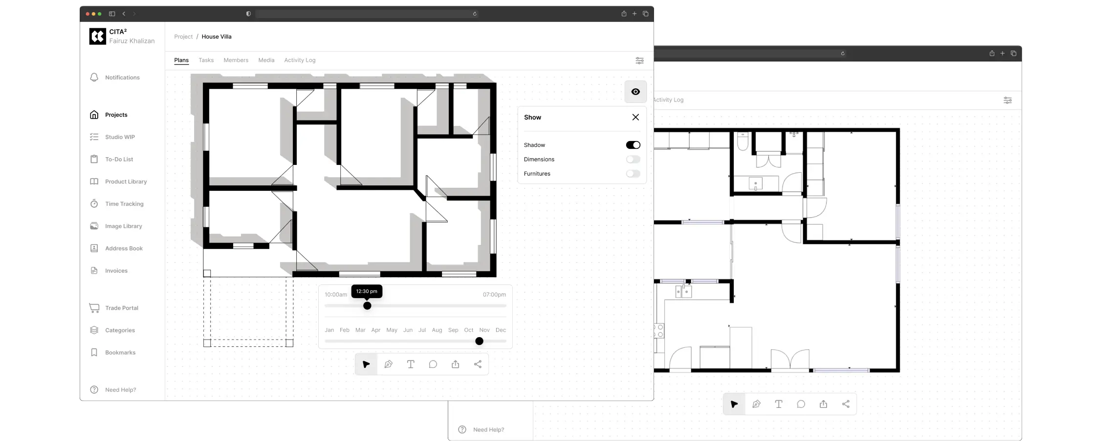
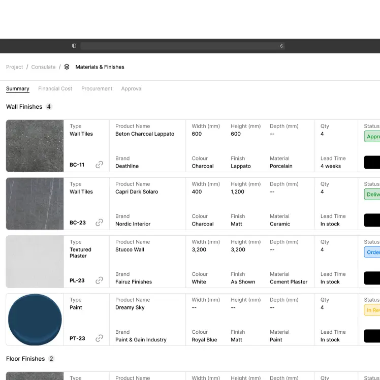
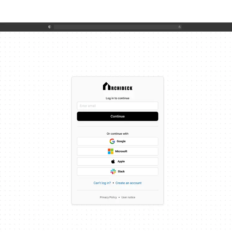
0.2 Desktop web page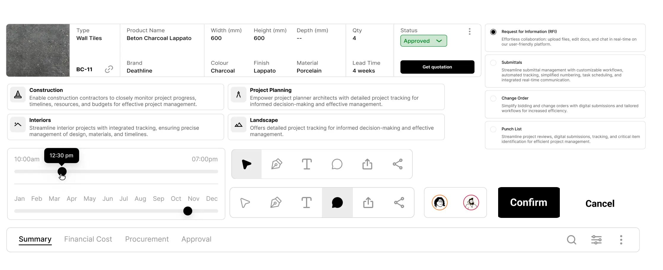
0.3 UI core componentsContext
An opportunity for an innovation.
There was no mistaking what they meant.
The need for a cloud-based communication tool to bridge the gap between architects and clients has been a persistent challenge in the industry.
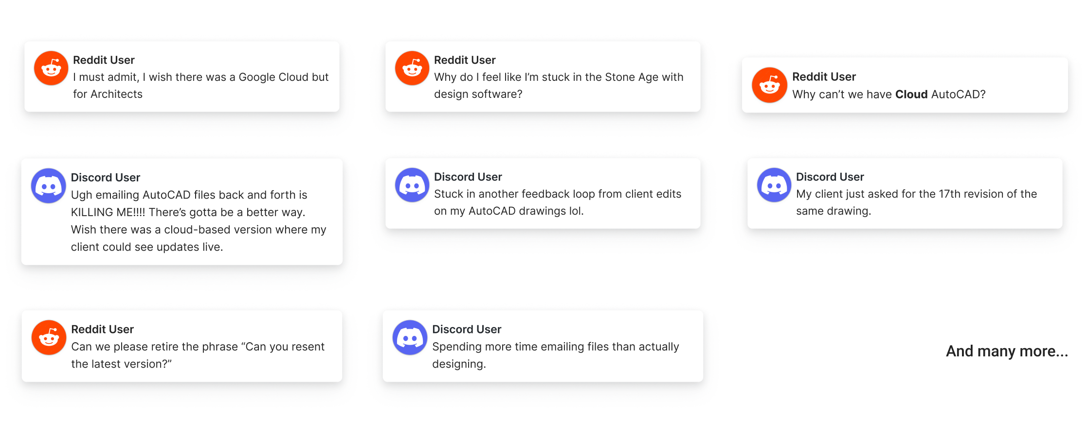
1.0 Press & community complaintsProblem
This has a different focus than traditional CAD tools.
A mixed bag of goals.
Online communities can generate a flood of ideas, but with everyone having different agendas, it's hard to find solutions that truly benefit everyone
While both Reddit and Discord communities are full of passionate users, their diverse needs and priorities can lead to a cacophony of ideas that aren't always aligned with creating a mutually beneficial experience.
Chat apps are a pain. Clients won't use them and downloading another app is a hassle.
VR Design Review. VR headsets can be expensive, not exactly ideal for every client meeting.
Challenge
CAD's precision with communicative collaboration, and light project management.
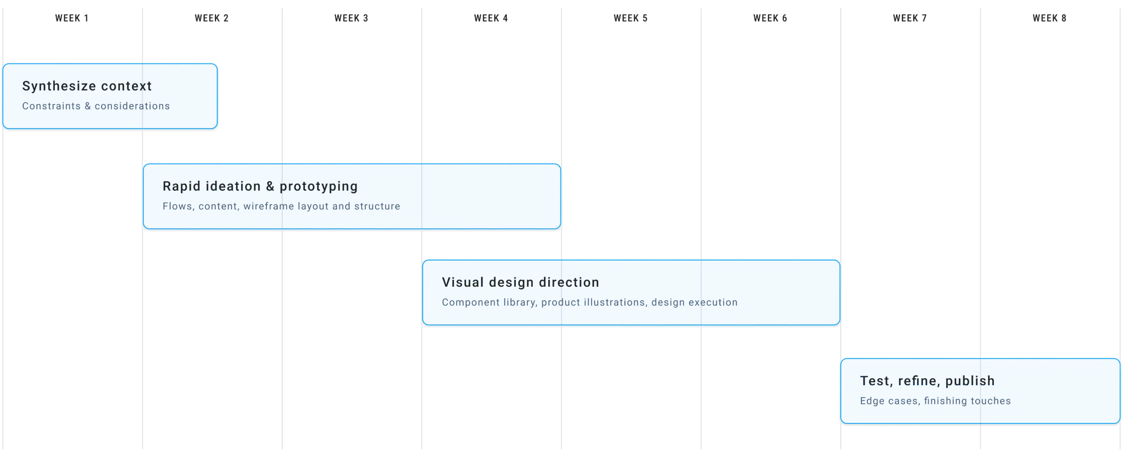
2.0 Project process within timelineFlow
Decoding the flowchart system
Investigating communication friction.
Effective communication is paramount to successful project completion in architecture but current workflows often face challenges that hinder smooth information exchange.
Not to mention, misplaced or lost files due to inefficient file sharing practices can disrupt workflow.
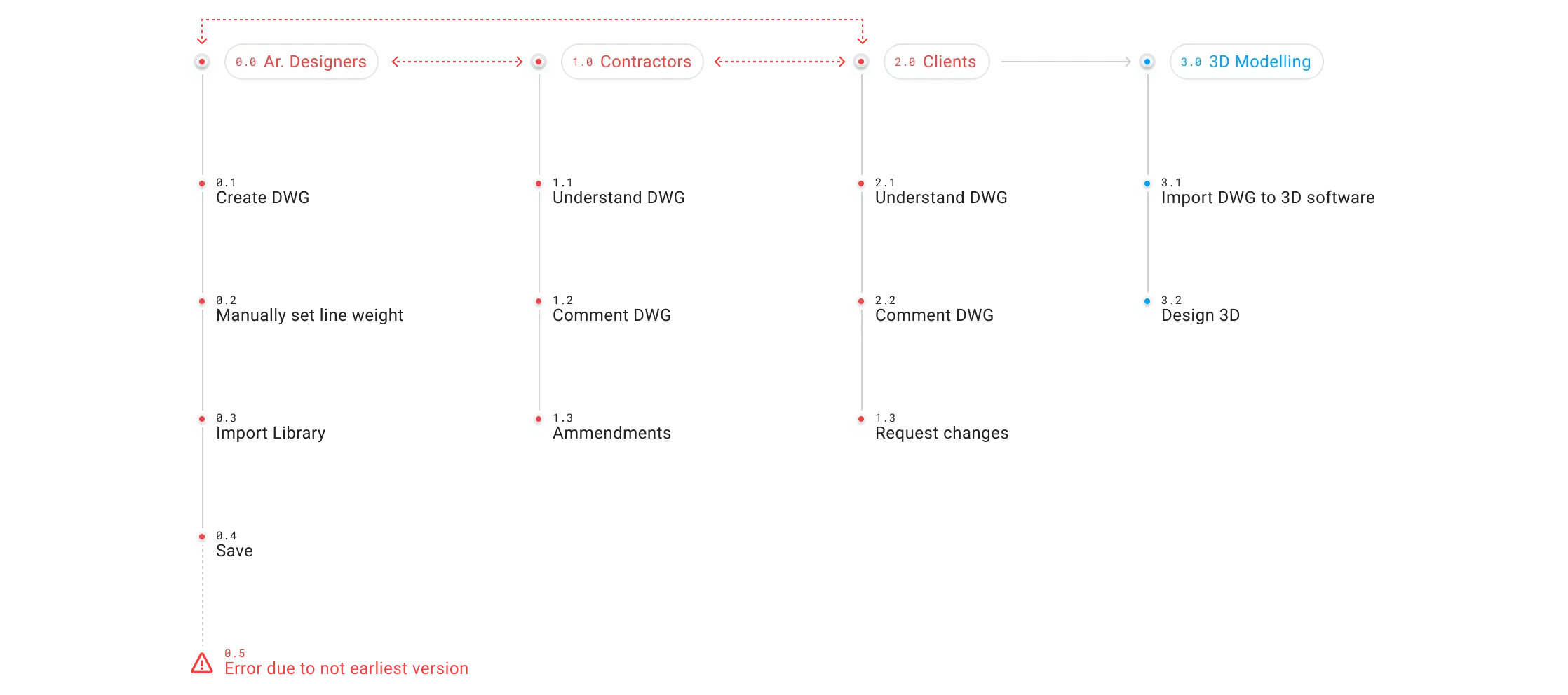
3.0 Current flowPinpointing the issues.
Efficient information flow is critical for successful project delivery within the industry however current workflows can be hampered by friction points that hinder collaboration as (Figure 3.1) illustrates.
(Figure 3.2) proposes an improved workflow designed to address the identfied friction point by integrating a cloud-based design system and collaborative tools.
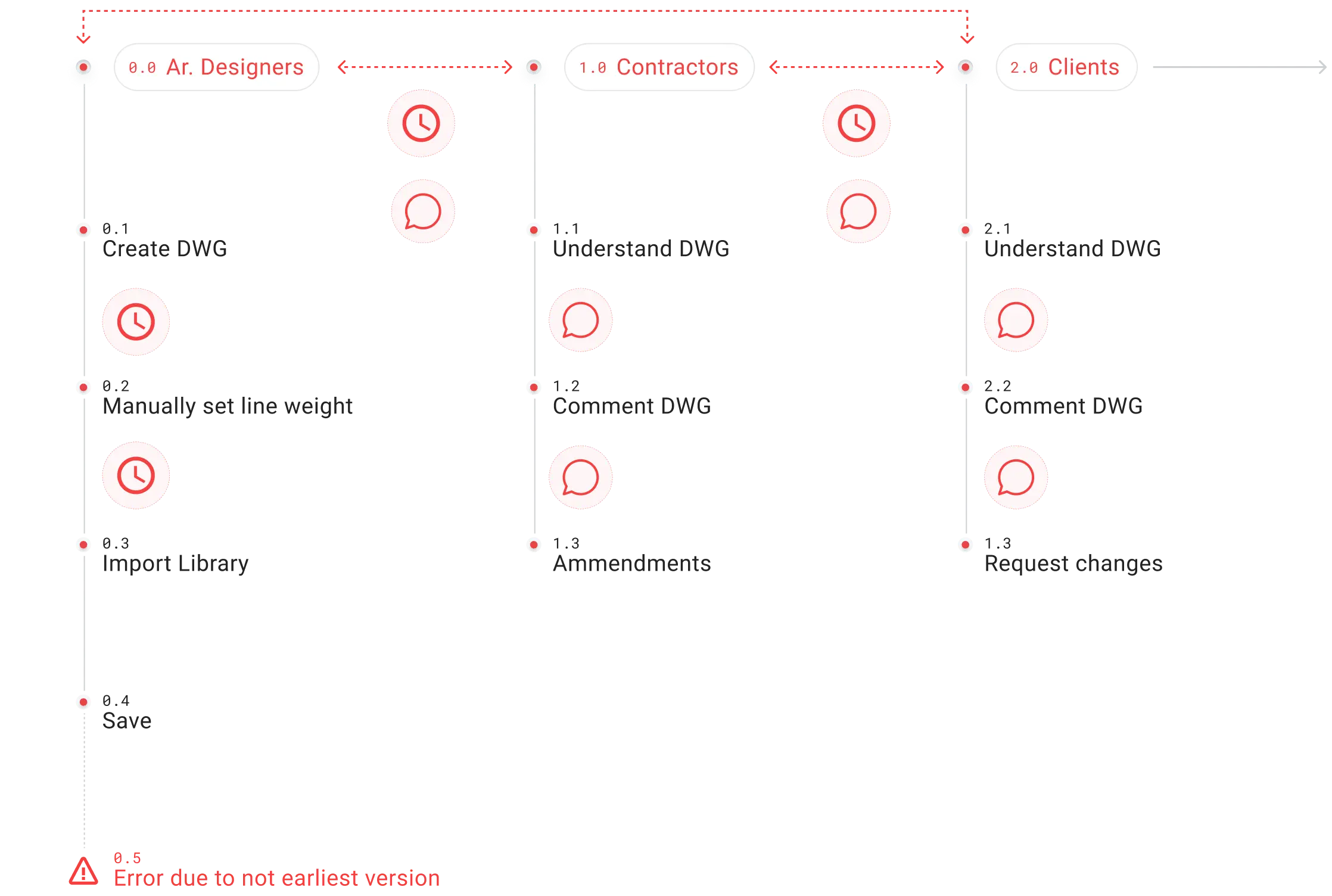
3.1 Current flow categorizedWasting time and effort due to manually set line weights or import elements individually.
Repetitive process increases design time.
Withouot a central library, updates made to individual design elements by one user may not reflected in existing DWG files.
My unknowingly use outdated elements, leading to errors and wasted efforts.
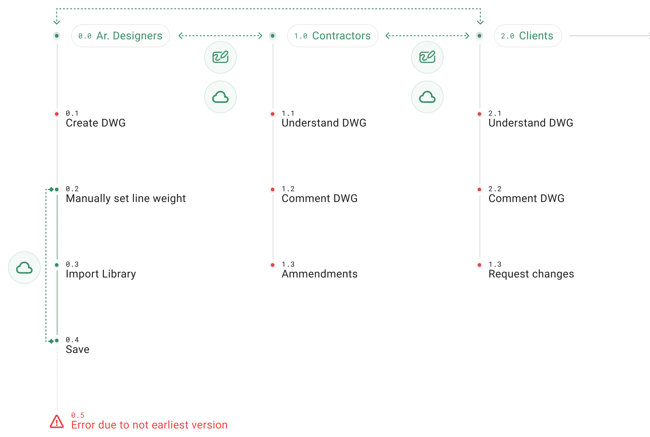
3.2 Improved flow categorizedA cloud-based library provides everyone with immediate access to standardized elements.
Changes made to the library are automatically reflected in all linked DWG files.
Reduce risk of version control issues and asynchronous updates.
Real-time feedback ensures stakeholders can provide immediate feedback.
Onboarding
Frictionless first impressions
Step-by-step sign-ups study.
Architects may lack familiarity with the functionalities and user interfaces of modern software platforms .
The differences in functionalities and workflows compared to established platforms like AutoCAD, Revit or Sketchup can create an adjustment period to integrate new software into their existing process.
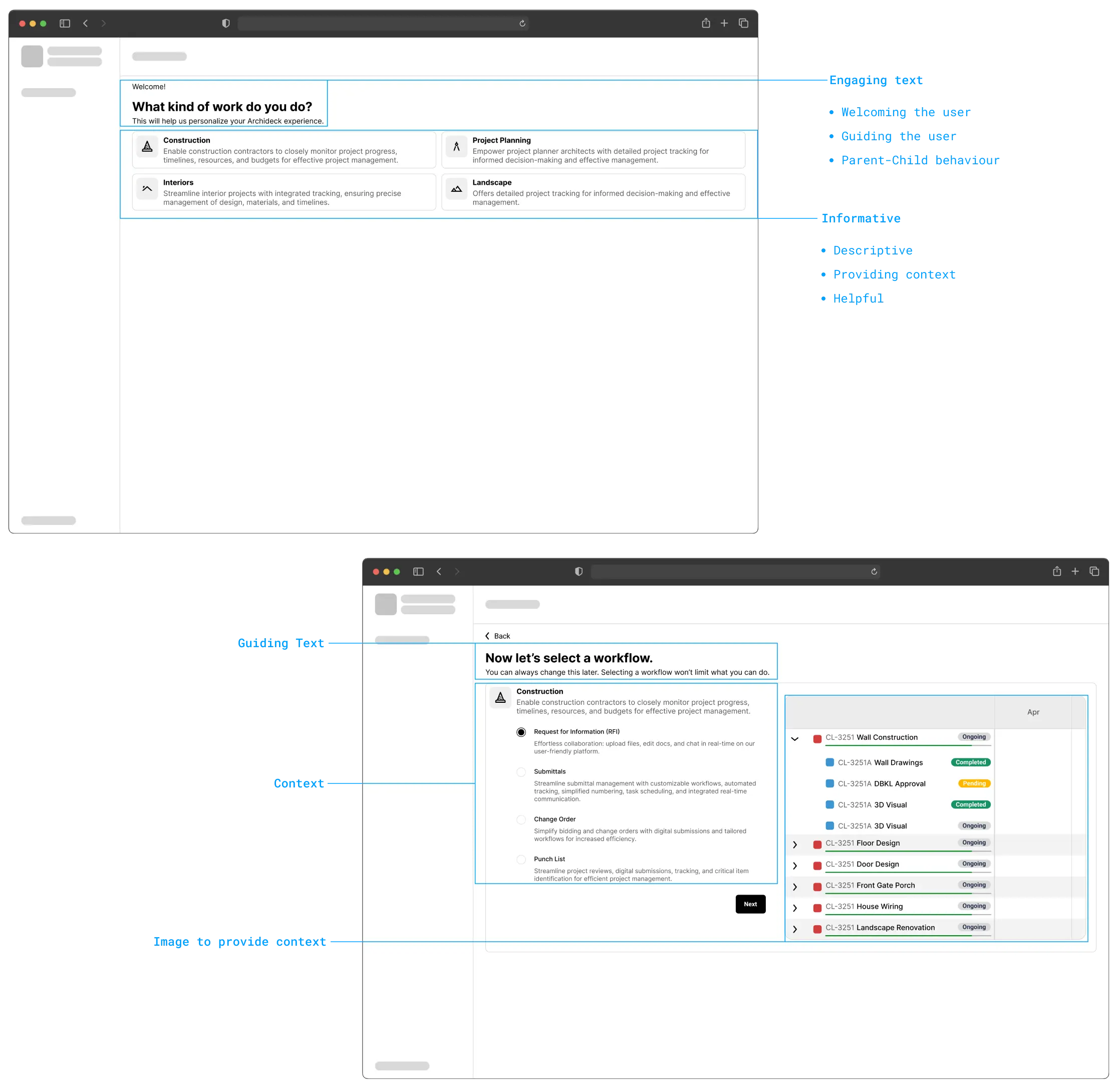
(Figure 4.0) suggests a step-by-step onboarding approach which aligns with feedback suggesting that such an approach is easy and intuitive.

4.0 Onboarding flowContextualizing sign-ups.
Traditional sign-up forms may lack context, leaving users unsure which options to choose or why they are signing up thus leading to abandoning the sign-ups.
The analysis of (Figure 4.1) which showcases the incorporation of brief contextual descriptions for various sub-industries within the sign-up process.
We also realized that skeleton offers a preview of the user interface leading them to understand of what awaits them after signing up.
4.1 Onboarding layout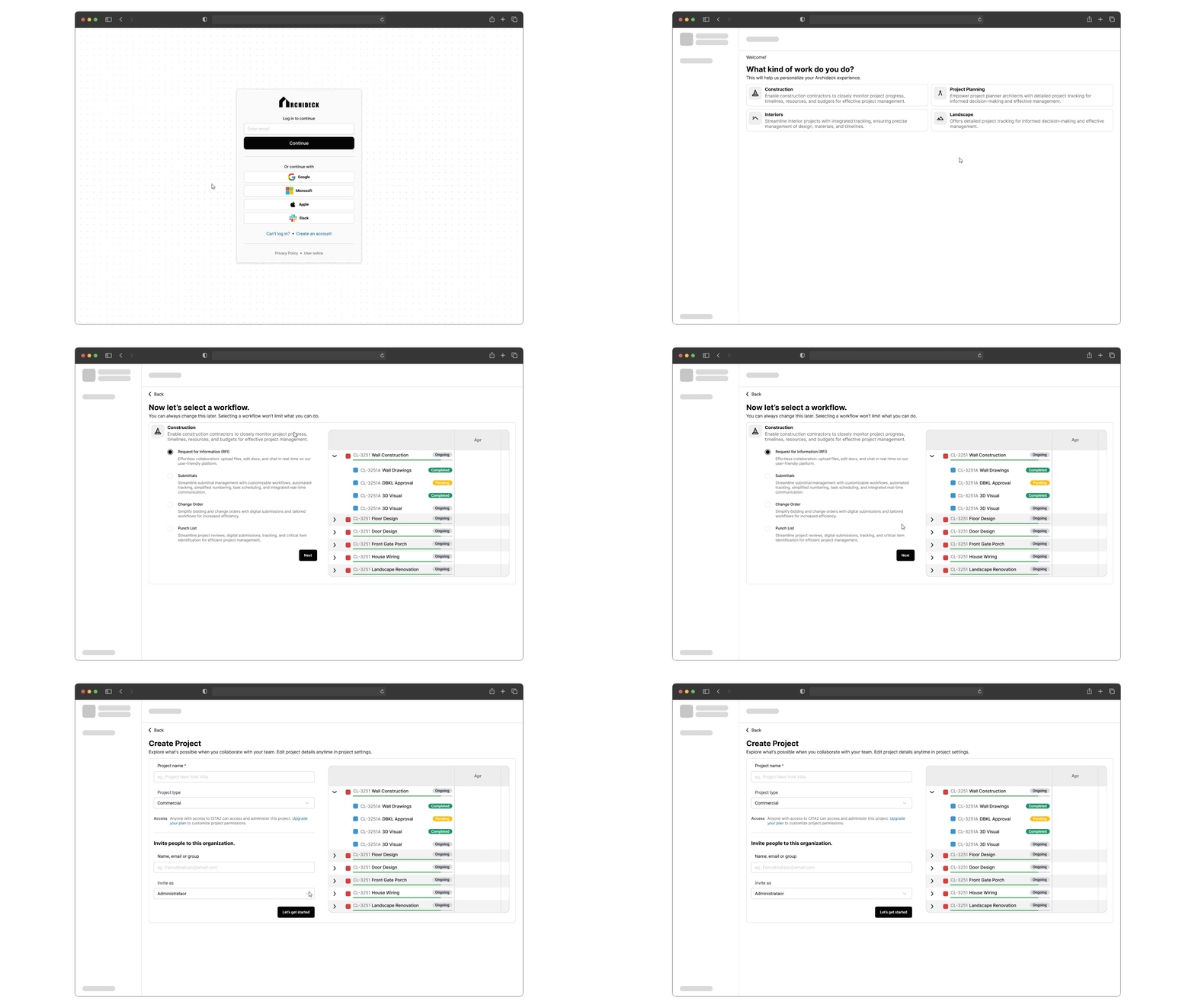
4.2 Onboarding walkthroughInteractions
Go modern, not clunky.
5.0 Canvas interaction
5.1 Floor details interactionReduce the risk of error by providing readily accurate information directly on the floorplan.
Simplifies communication between everyone involved by ensuring everyone is referring to the same information.
Quick access to information to make faster descisions.
If the architect does not draw the spaces accurately, the system might get confused and not show the right details when clicked.
On complex floorplans, too much data on the screen can overwhelm users.
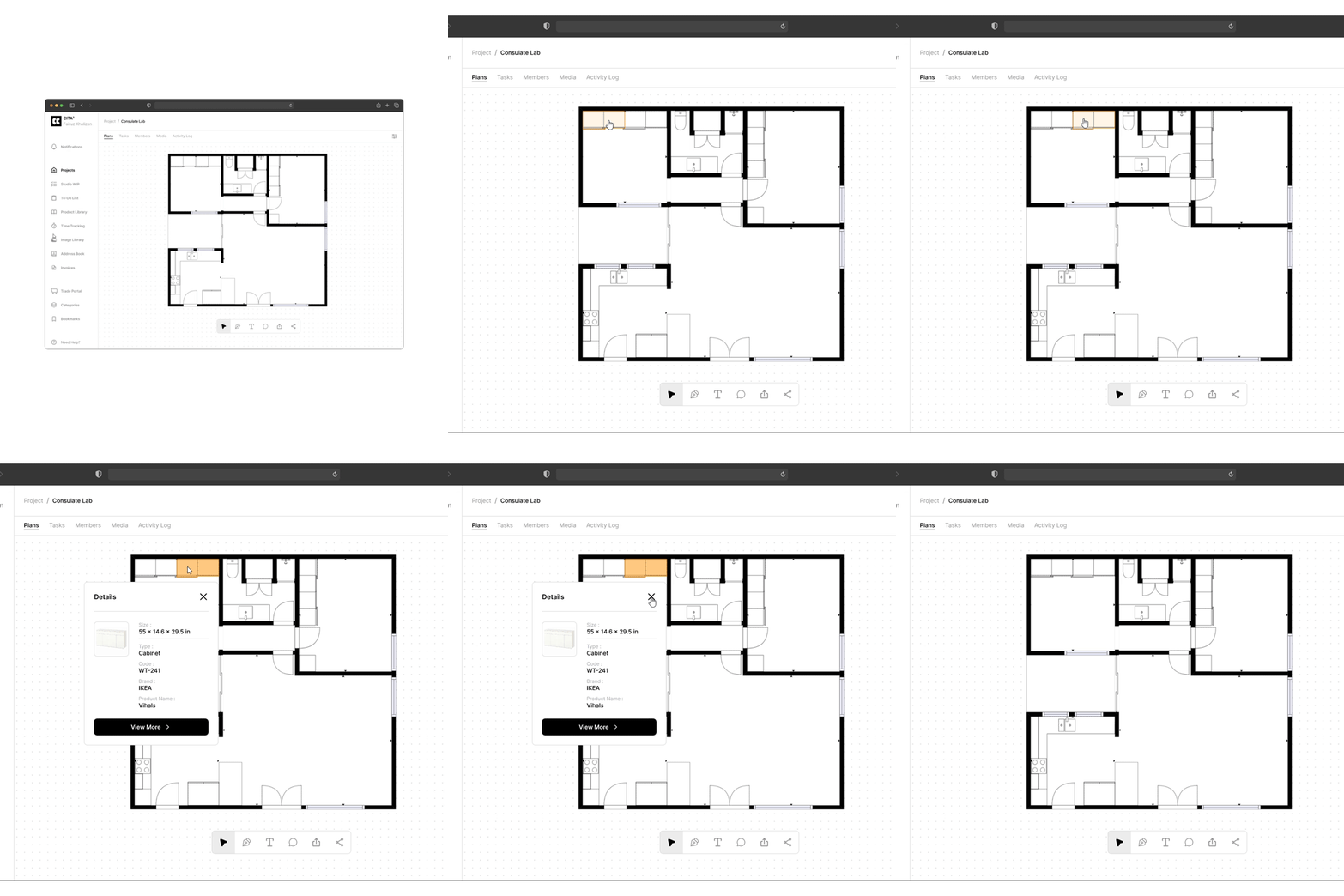
5.2 Funiture details interactionFurniture details are readily available, eliminating the need for separate documents and spreadsheet
Everyone involved in the project can access furniture details easily, facilitating smoother communication.
Not suitable for custom-designed that are not readily captured by brand, model and material data.
Relies on architects meticulously entering details for each piece of furniture.
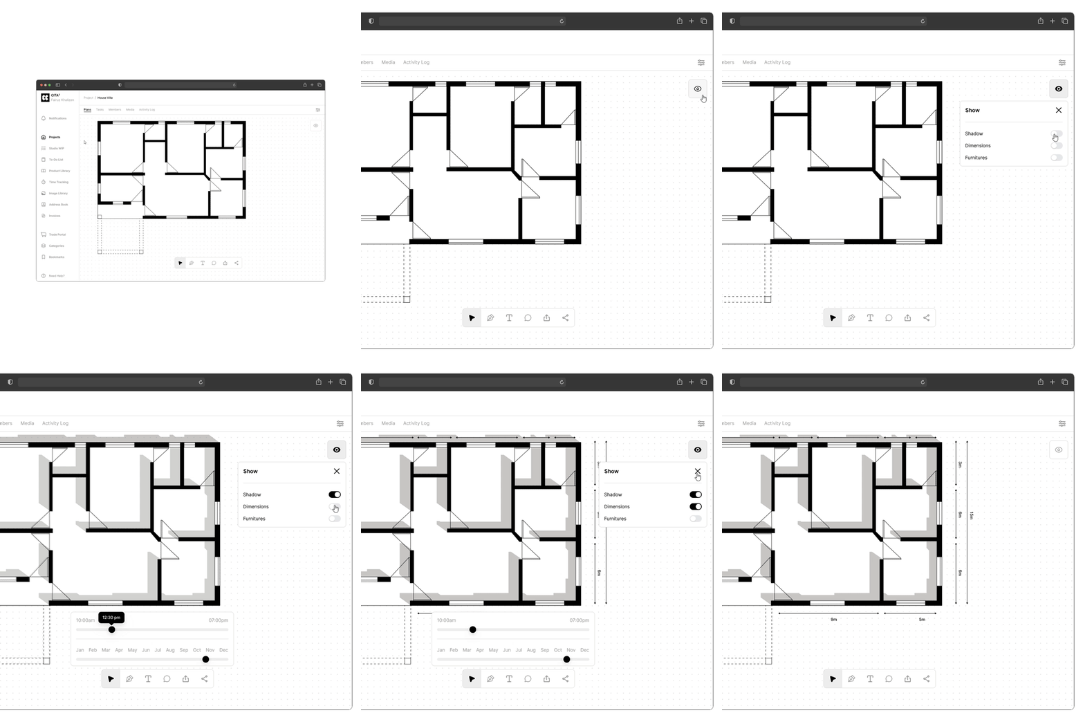
5.3 View options interactionAvoiding layout mistakes or miscalculations by having immediate access to dimensions and sun impact.
Presenting a design, users can leverage dimensions and sun direction visuals to the clients.
The option to switch between views prevents the interface from becoming cluttered with too much information at once.
Complex sun direction calculation and shadow rendering might impact performance on less powerful devices.
Accuracy of sun direction relies on the user correctly inputting the project's location data.
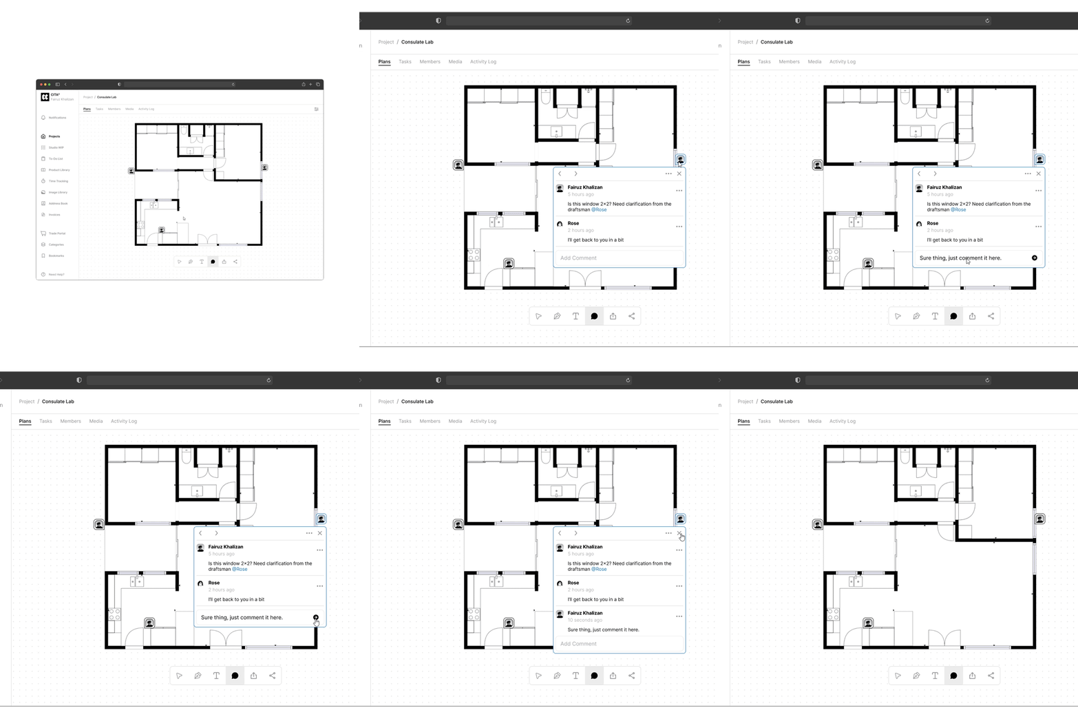
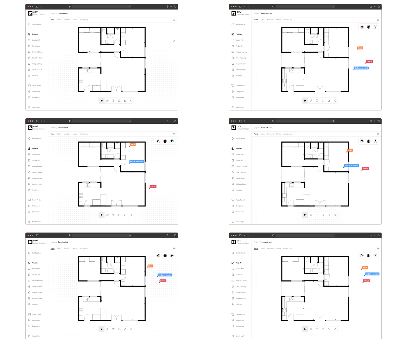
5.4 Commenting interactionPinpoint specific areas on the floor plan and no more ambiguity abaout what needs addressing.
Eliminate the need for the lengthy email threads and scattered feedback.
Comments are tied to specific floorplan versions, providing a clear history of design changes behind them.
Too many comments on a complex floorplan can create a cluttered visual experience.
Challenging to navigate through a large number of comments.
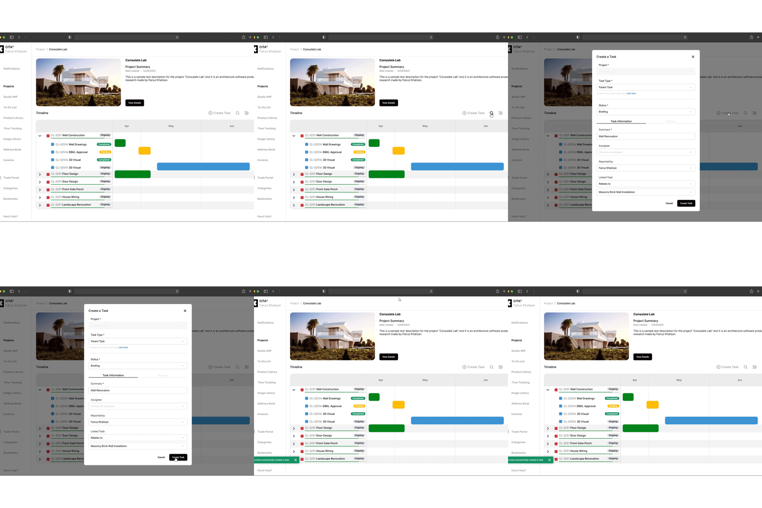
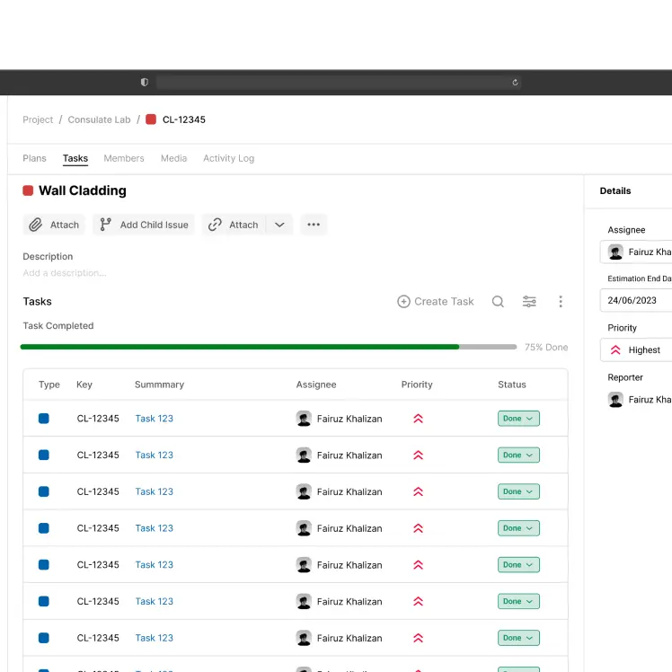
5.5 Adding task interaction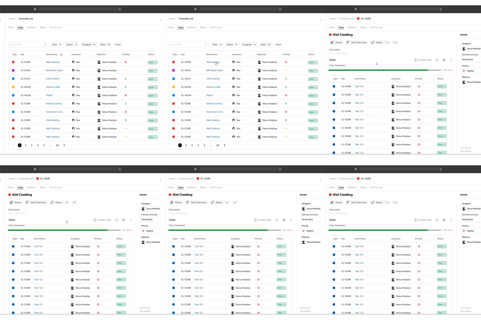
5.6 Task details interaction@embarrossment