To see full case study, click link below
PDF not available (coming soon)
Project Type
Personal Redesign
My Role
UIUX Designer
Timeline & Status
1 Week, Conceptual
Overview
Flexi Parking emerges as a key player in Malaysia's urban mobility landscape, offering a mobile application that simplifies the often-frustrating task of parking payment.
This shift towards a cashless, digital solution aligns with broader trends in smart city development, where technology is harnessed to optimize resource allocation and enhance user experience.
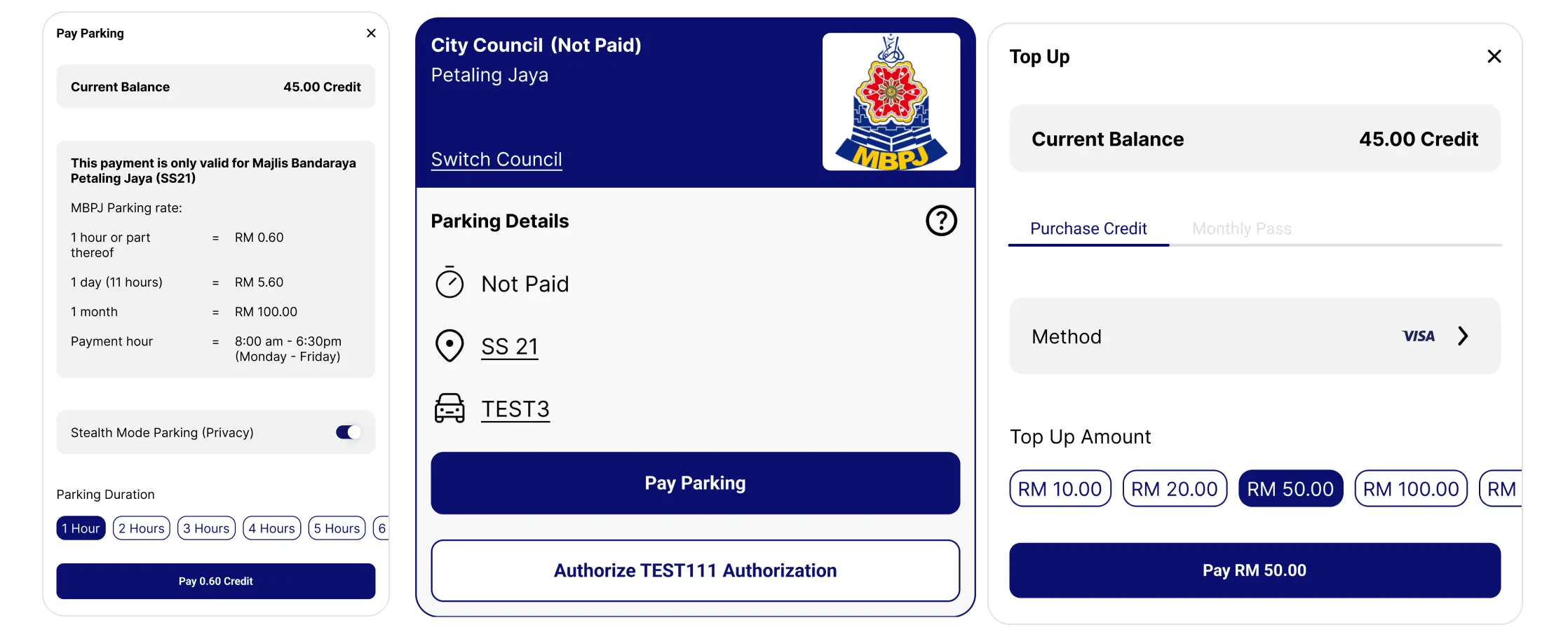
0.1 Sample UI components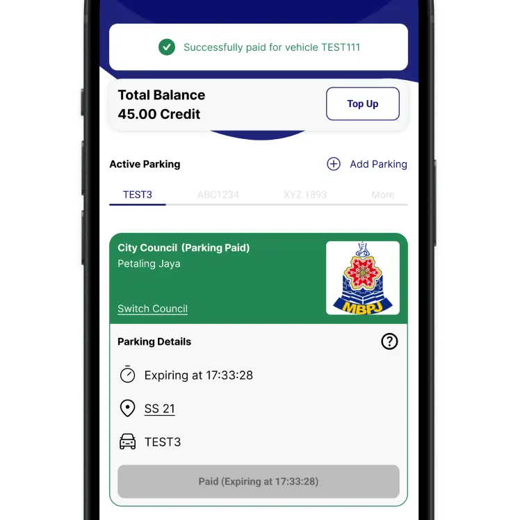
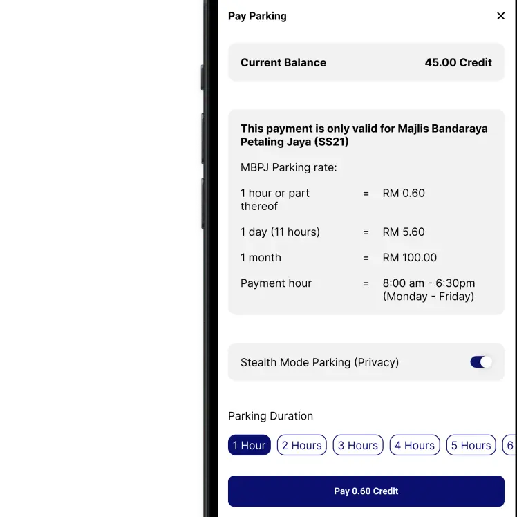
0.2 Phone screensContext
User voices on the ground.
User reviews unveil UX concerns.
While flexi parking offers a seemingly convenient solution for parking payments in Malaysia, user experiences on social media platforms like Twitter paint a different picture.
A closer look at user complaints can provide valuable insights for a potential redesign effort.
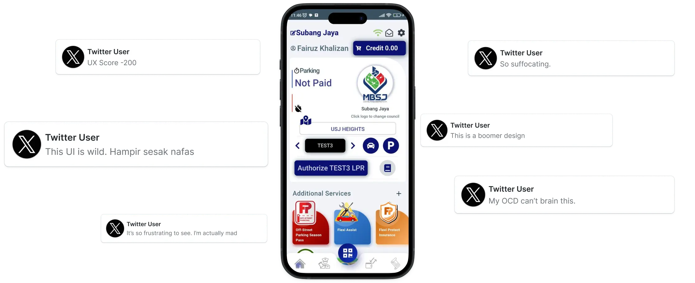
1.0 Press & community complaintsProblem
Deep dive to identify UX issues.
Seamless payments, sacrificed experience?
While Flexi Parking offers a promising solution for streamlined parking payments in Malaysia, a closer look at UX reveals areas for improvement.
Interface cluttered with unnecessary information.
Users report difficulty navigating the app.
The app's functionality might not be readily apparent to first-time users.
Challenge
A timeline for research and redesign.
Bridging the UX gap.
(Figure 2.0) presents the condensed timeline for our initial redesign of Flexi Parking.
By prioritizing core functionalities – payment and topup – we achieved a rapid turnaround, completing the design iteration within a week.
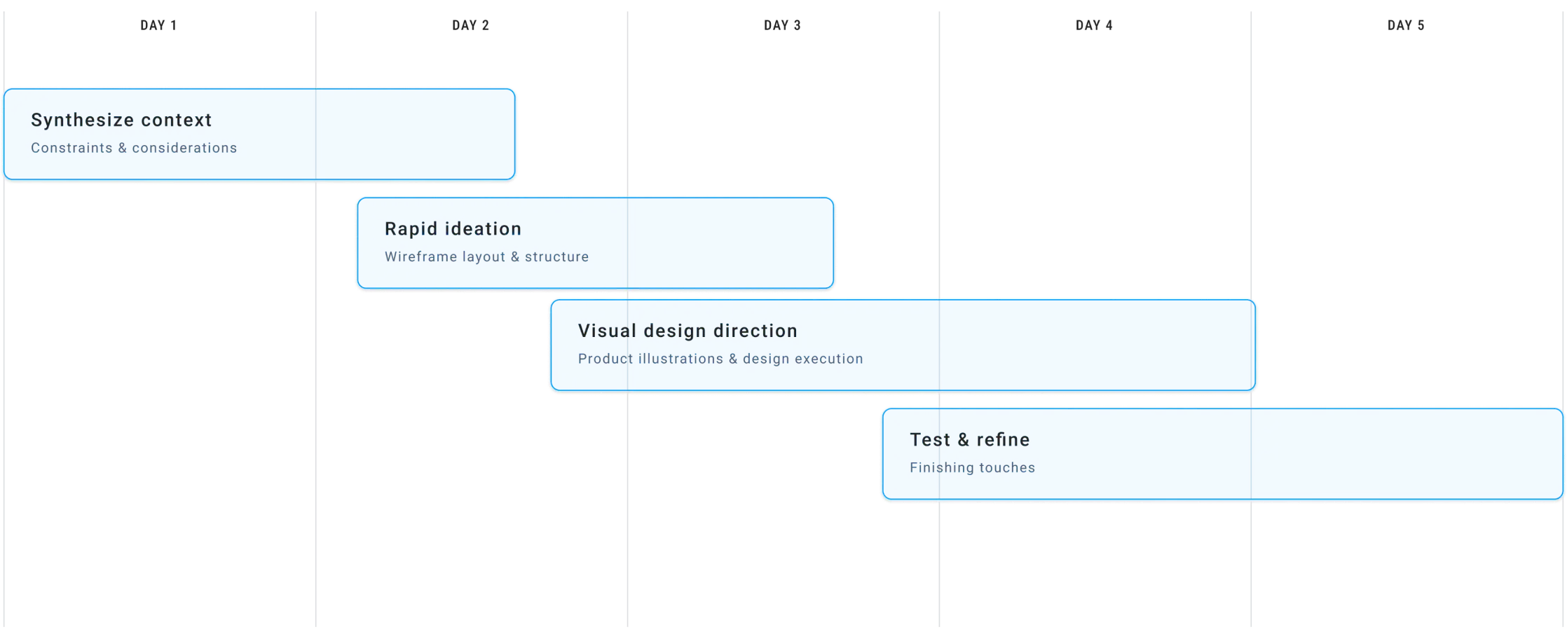
2.0 Project process within timelineFlow
A users flowchart analysis of Flexi Parking.
Visualizing efficiency (or is it inefficiency?)
While Flexi Parking offers a variety of functions, the core user experience revolves around the process of paying for parking.
In (Figure 3.0), it presents a summarized user flowchart that visually depicts this core functionality, highlighting the steps involved from initiating payment to successful completion.

3.0 Basic flowchartRedesign
Envisioning a new entry point.
From clutter to clarity.
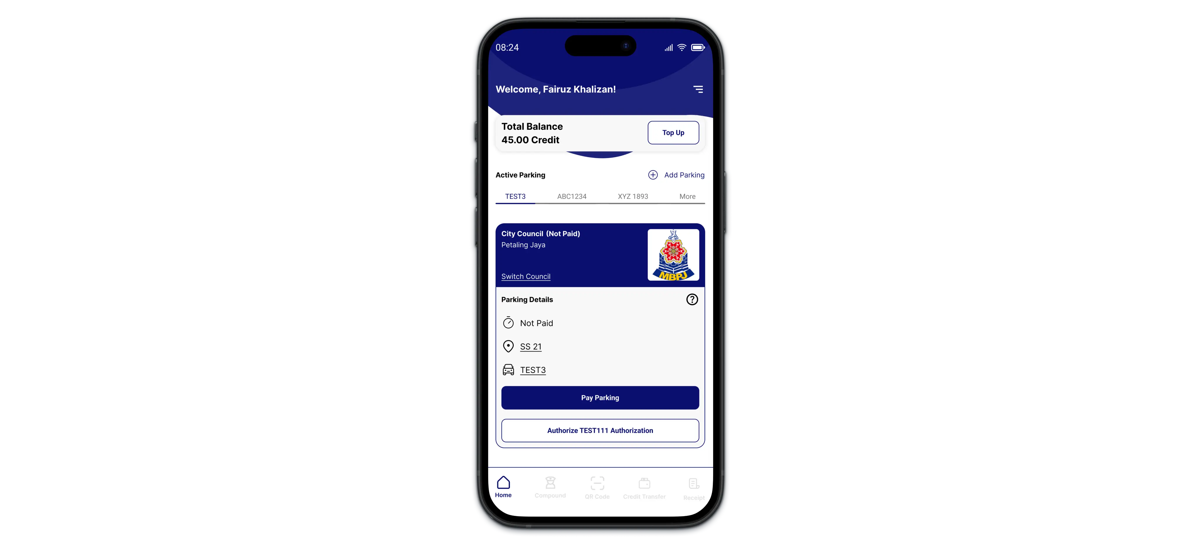
This section delves into the visual transformation of the Flexi Parking homepage, comparing the existing design (Figure 4.0) with the proposed redesign (Figure 4.1).
The visual comparison between (Figure 4.0) and (Figure 4.1) demonstrates the potential of design to improve user experience.
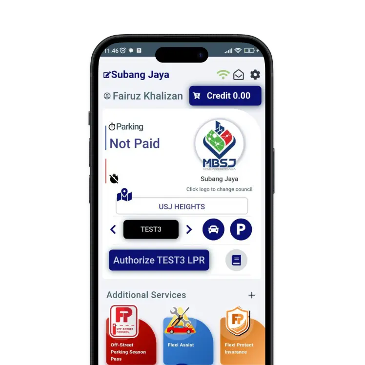
4.0 Old homepageCluttered with unnecessary information, overwhelming users and hindering their ability to locate essential features.
Unintuitive button placement and unclear labeling can make difficult for users, especially first-time users, to understand the app's functionalities.
Poorly designed visual hierarchy might fail to priortize key actions.
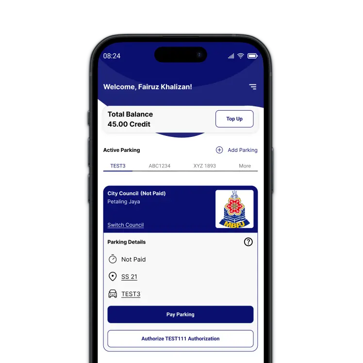
4.1 New homepageFamiliar design patterns can shortened the time it takes user to understand the app's functionalities and complete desired actions.
Clear button labeling and an intuitive layout minimizing user frustration and improve overall user experience.
A user-friendly design fosters a sense of confidence in using the app.
Optimizing the clickstream.
This section delves into the UX of the payment process within the app, comparing the existing design (Figure 4.1) with the proposed redesign (Figure 4.2).
This visual exploration highlights key limitations of the current design and demonstrates how the redesign addresses these issues to optimize the fast and efficient payment experience.

4.2 Old parking paymentThe user's total availalbe credit might not be readily apparent in the initial view.
Heavily rely on icon is not intuitive.
Estimating the required credit amount for a desired parking duration might necessitate manual calculations.
Require to navigate through multiple screens or perform reptitive actions to complete the payment process.
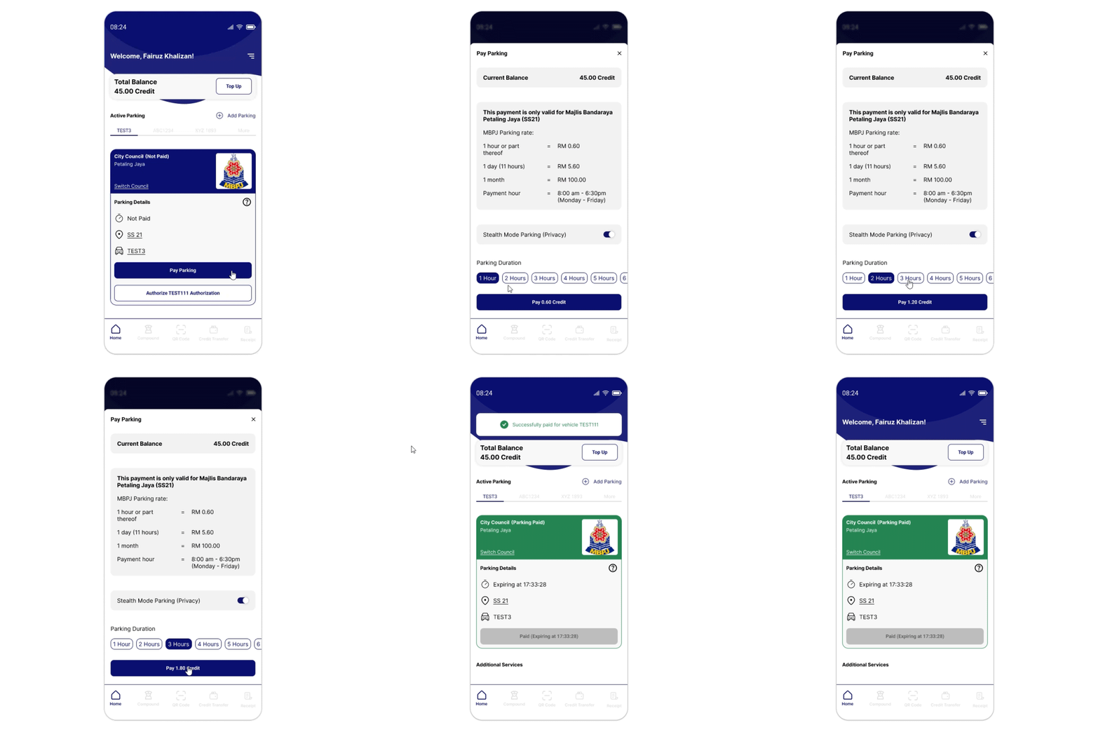
4.3 New parking paymentThe user's total credit balance is prominently displayed within the initial view.
Proper CTA leading to an intuitive approach.
Interface integrates a feature that automatically calculates the required credit amount based on the chosen parking duration.
Condensing the process into a single screen to complete the payment.
Frictionless transaction.
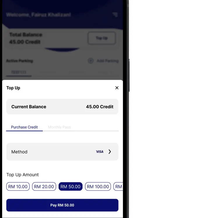
This section delves into the UX of the Flexi Parking top-up functionality, comparing the existing design (Figure 4.1) with the proposed redesign (Figure 4.2)
This exploration highlights user feedback and research insights to demonstrate how the redesign aims to address confusion and streamline the top-up process.
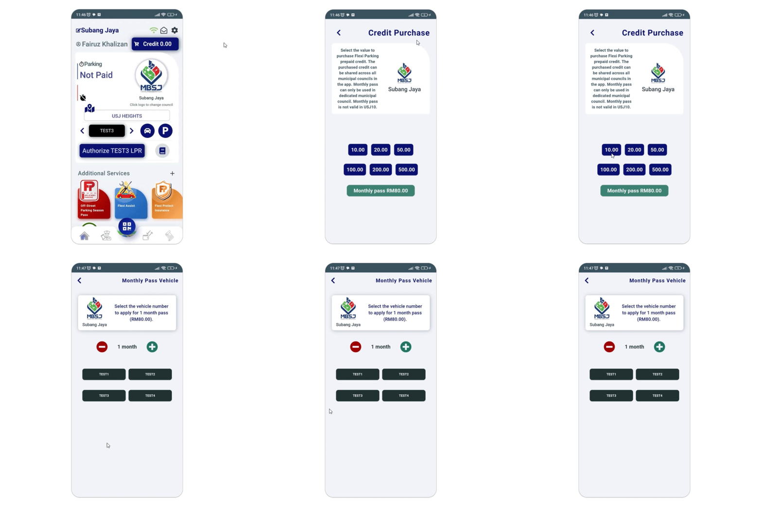
4.4 Old parking paymentSeparating top-up options for credit and monthly passes is not readily apparent.
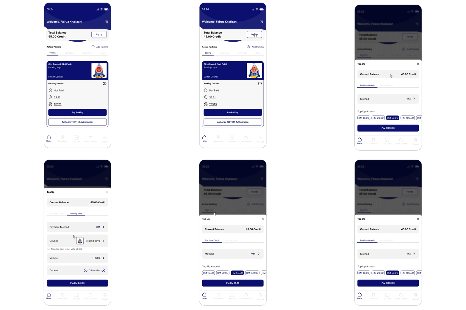
4.5 New parking paymentAdding credit and purchasing monthly passes under a single, unified experience.
Maintains a similar user flow and visual language as the redesigned parking payment process.
Key learnings
The power of familiarity.
Visual communication matters.
Redesigning the Flexi Parking app offered valuable insights into user-centered design principles and their application in optimizing a mobile payment platform.
Drawing inspiration from familiar Malaysian applications like MySejahtera and Grab resonated with users, reducing the learning curve.
Over-reliance on icons without clear labels created ambiguity in the old design.
A cluttered and information-heavy interface in the old designed overwhelmed users.
@embarrossment