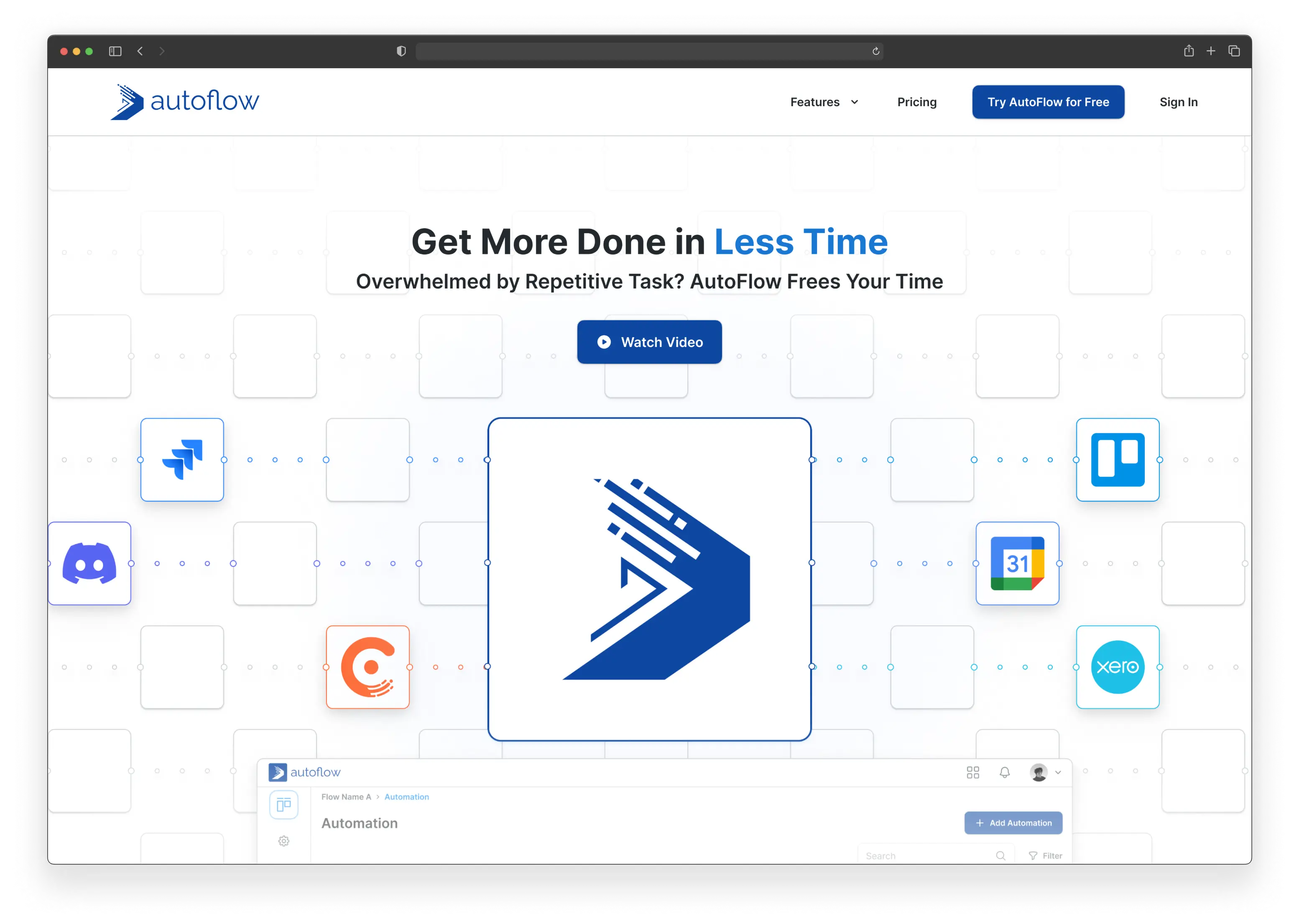
To see full case study, click link below
PDF not available (coming soon)
Project Type
Professional
My Role
UI/UX Designer
Timeline & Status
8 Months, Beta Launched in April 2024
Overview
During my time at Biztory, I played a key role in developing AutoFlow, an extension of their platform that enhances task management with built-in automation features.
Addressing a significant user need, Biztory introduces AutoFlow, a task management and automation solution.
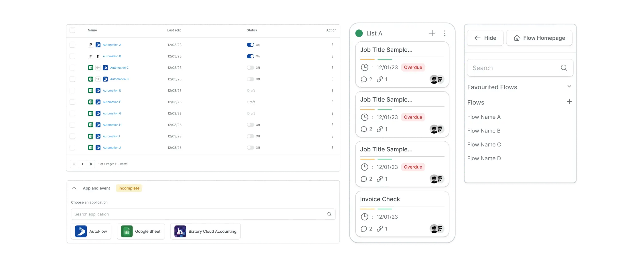
0.1 Sample UI components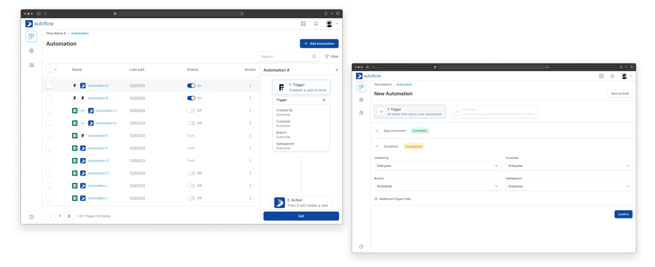
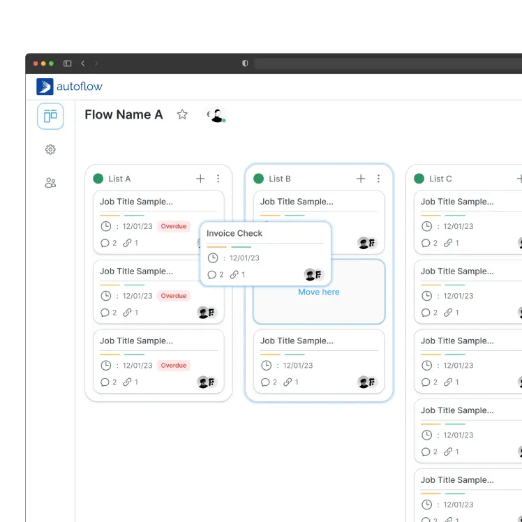
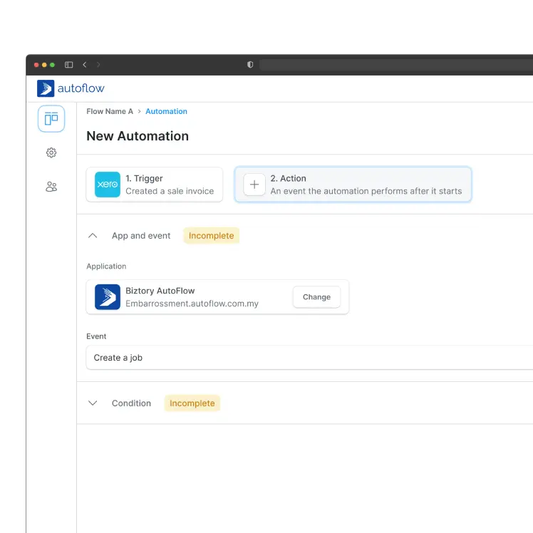
0.2 Desktop web page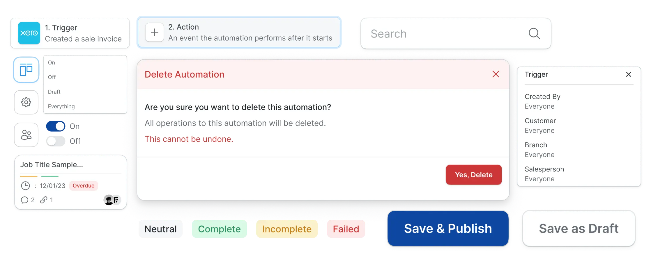
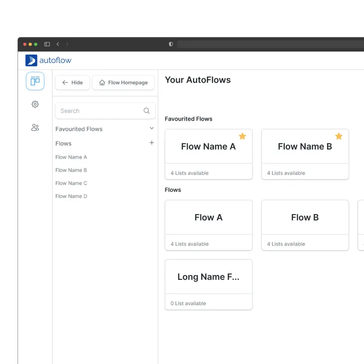
0.3 UI core componentsContext
A chance to engage a new customer group.
We hear you. I hear you.
We've identified a trend among some of our several valued loyal customers, who represent significant growwth potential have expressed a shared desire.
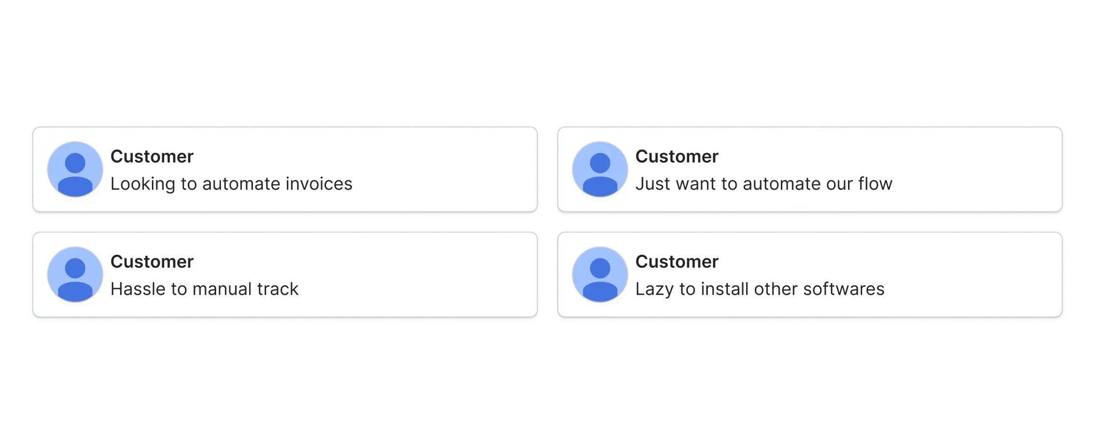
1.0 Customers requests from CSProblem
Industries have unique workflows and require specialized automation solutions.
A definitive niche hasn't been identified yet.
Our initial strategy to cater to all types of small businesses has revealed valuable insights.
However, to maximize our impact, we're conducting further research to identify the specific segment within the small business market that will benefit most from our offering.
Subscription fees. A financial burden for some small businesses, especially if they don't fully utilize its features.
Complex workflow. Creating complex workflows may require technical knowledge for less tech-savvy users.
Challenge
Keeping it simple to use, even with robust features.
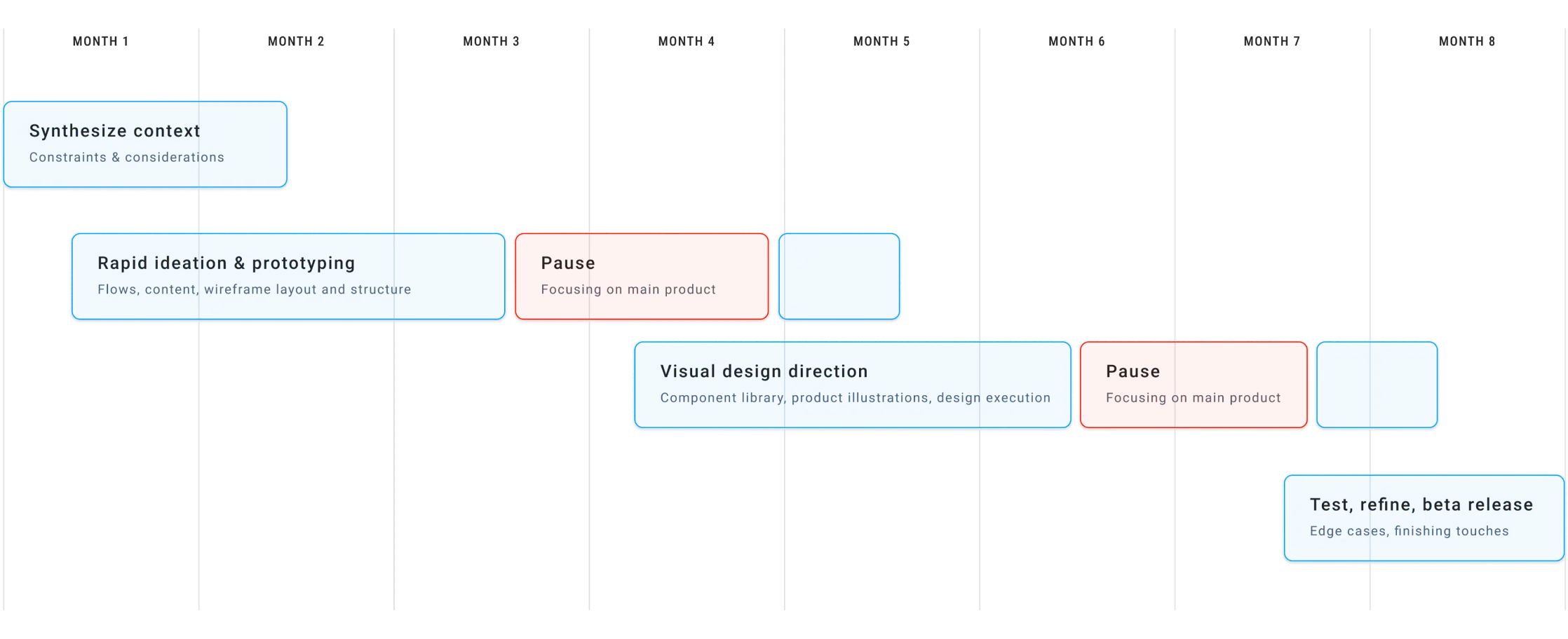
2.0 Project process within timelineFlow
The system behind the scene
You gotta start somewhere.
The initial set of instructions presented a unique challenge which is their unconventional format held the potential to overwhelm users with information overload.
In (Figure 3.0), I categorized the steps into distinct stages and simplifying the overall process thus allowing users to follow each step sequentially.
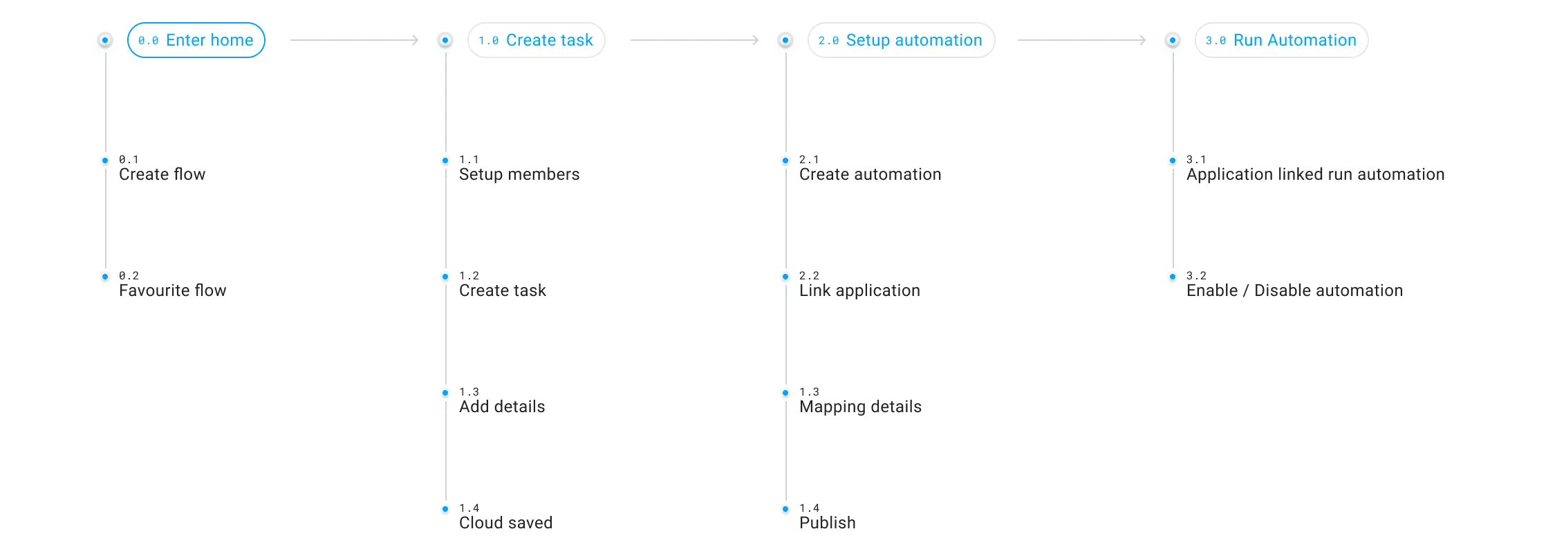
3.0 Summarized flow chartKanban board
Clear, consistent, at-a-glance.
Old school layout, modern efficiency.
The kanban board layout is a popular choice for a task tracking because it offers a clear visual representation of workflow, which is familiar to most users.
The most efficient way to tackle tasks? Working within a familiar system that fosters clear understanding.
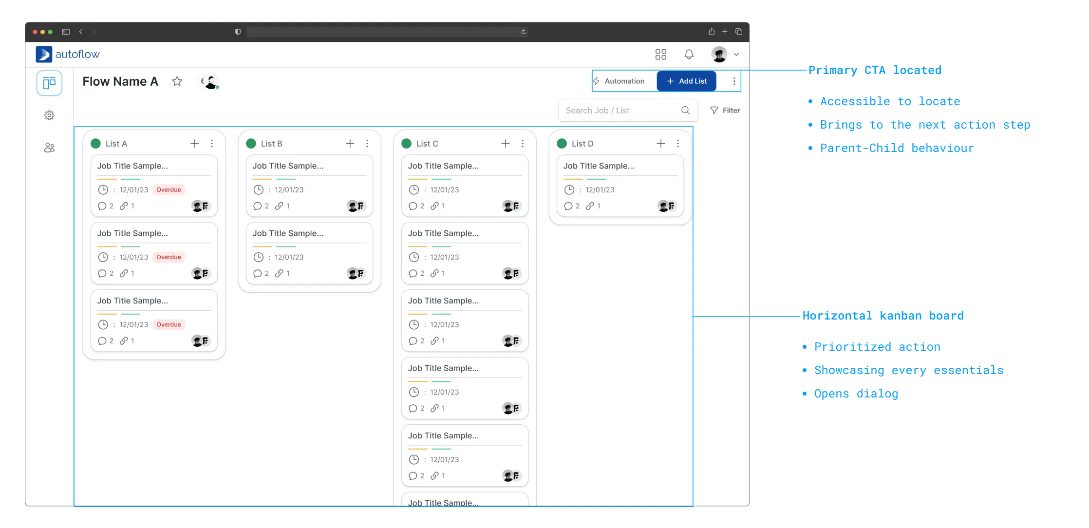
4.0 Kanban layout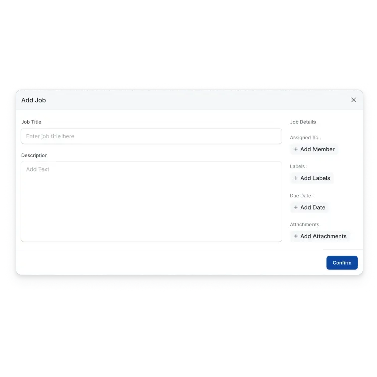
4.1 Add job dialog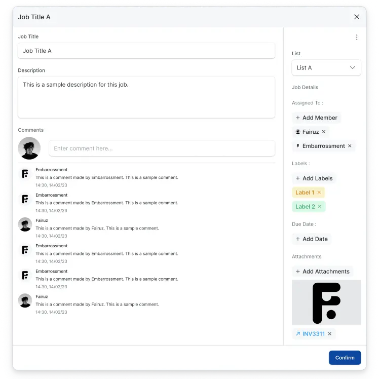
4.2 Edit job dialogThe eye-tracking experiment.
Our initial design (Figure 4.3) prioritized including detailed information within the Kanban card to provide a comprehensive view of each task.
However we recognized that excessive information could be counter productive, potentially hindering workflow efficiency.
The second iteration (Figure 4.4) addressed this by leveraging a more visual approach as we utilized colours and icons to represent a key information.
The positive feedback confirmed that the second iteration offers the optimal balance between information clarity and usability.
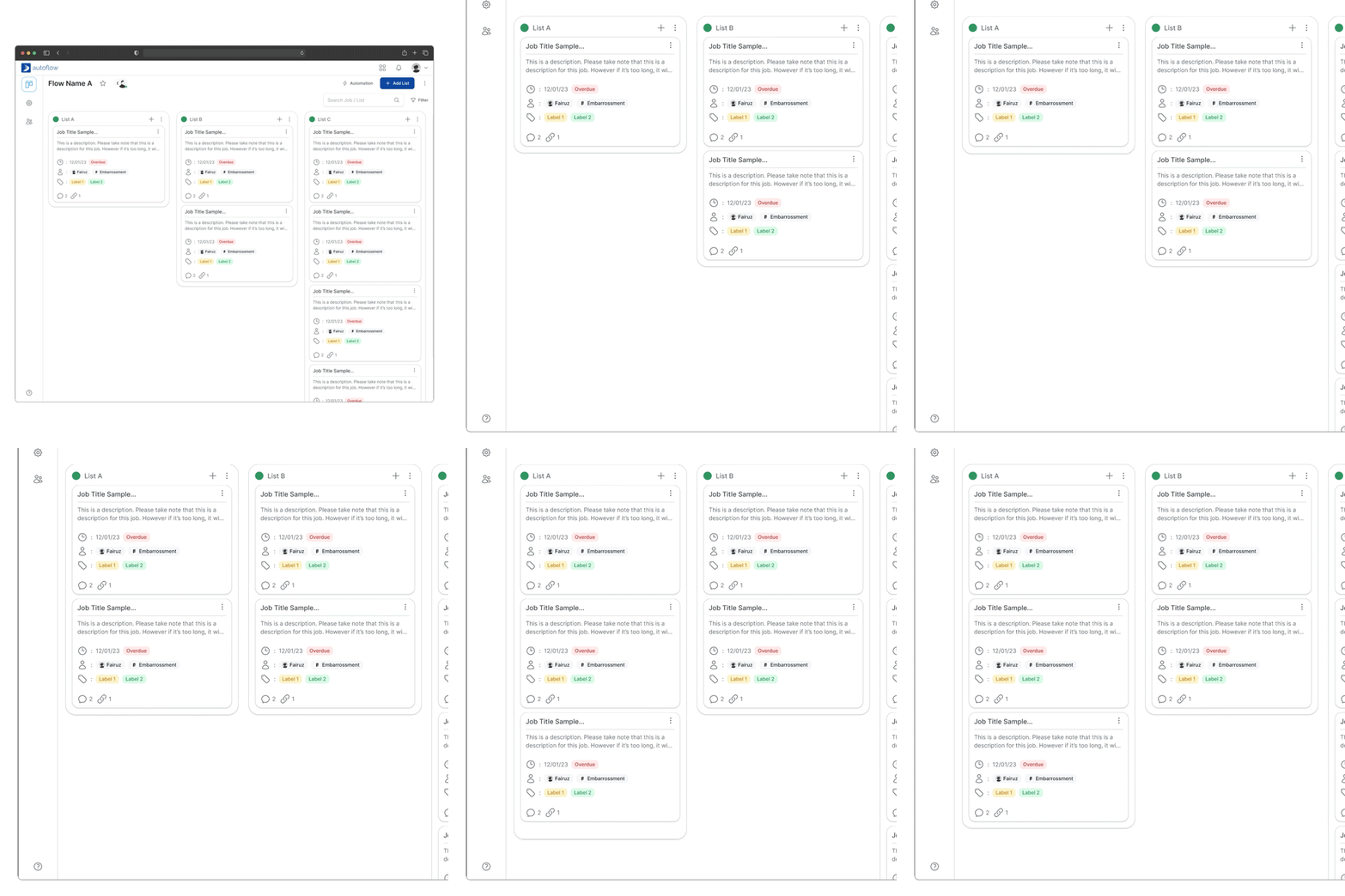
4.3 A/B testing (Test A)Reduces the need for users to click through separate information windows.
Require more scrolling to see multiple cards on a single screen, potentially hindering workflow overview.
Cluttered with too muchh information if not designed thoughtfully.
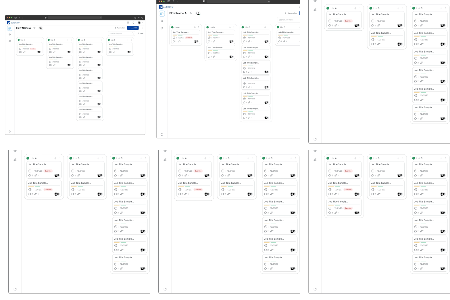
4.4 A/B testing (Test B)Allow display more cards on a single screen.
Discourage overloading cards with unnecessary details.
Prioritize on essential informations by relying on icons and colour coding.
Cards might require user familiarity with the icon system to understand the task detail.
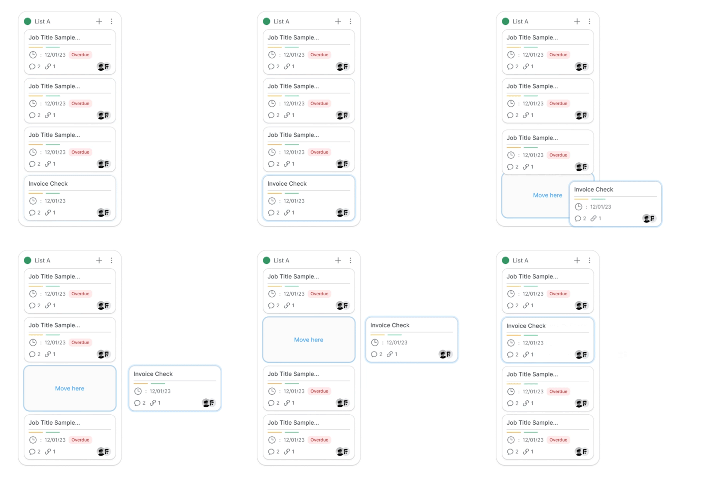
4.5 Move list interaction
4.6 Input interactionAutomation library
Information accessibility
Reducing the cognitive load.
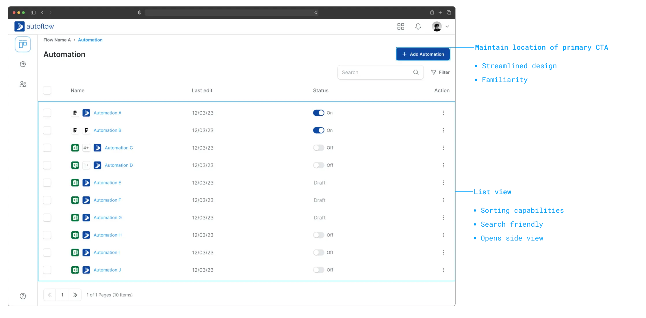
Our primary objective was to significantly improve the searchability of information but we also wanted to recognize the importance of maintaining user familiarity.
Since a significant portion of our user base transitioned from our existing product, we opted to leverage this familiar format as the foundation for the new interface.
As illustrated in (Figure 5.0), this enhanced view presents a comprehensive set of relevant details while retaining the core functionalities users are accustomed to from our other product.
5.0 Table list layout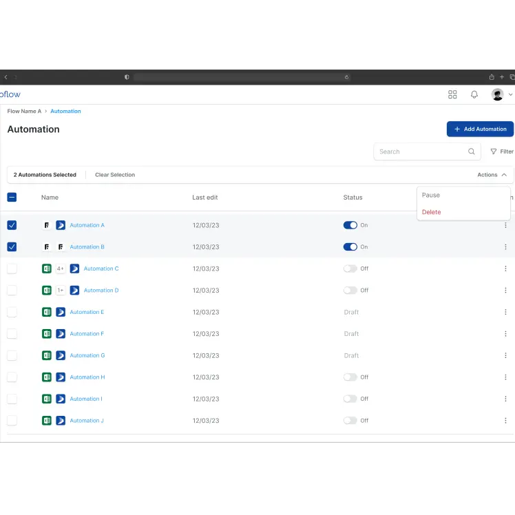
5.1 Bulk action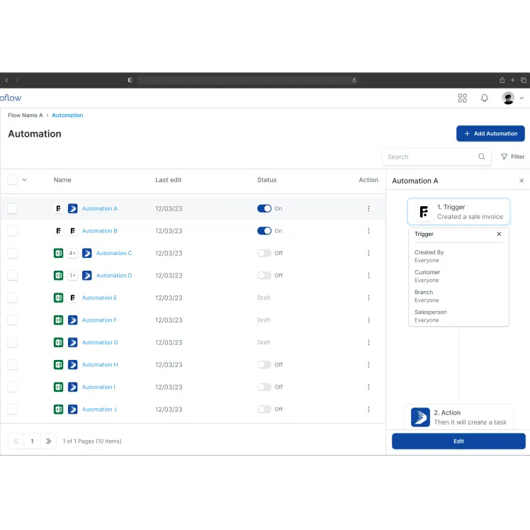
5.2 Side viewThe role of micro interactions.
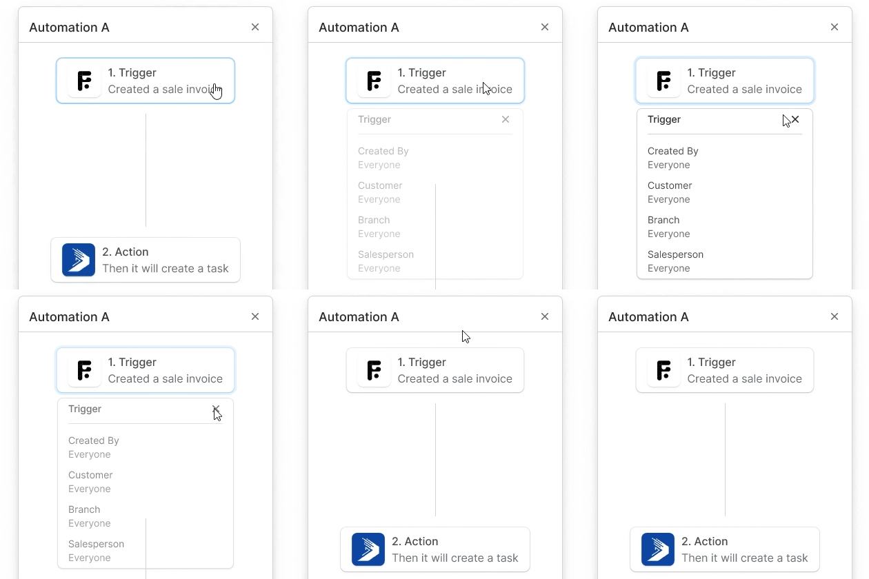
Our objective was to present a clear overview of a pre-configured automation, particularly for users who might manage numerous linked applications within their automation setup.
The decision to utilize a step-by-step micro interaction in (Figure 5.3) is grounded in the understanding that the users may experience information overload when presented with a comprehensive overview of a multifaceted automation, especially when dealing with multiple linked applications.
5.3 Side view interaction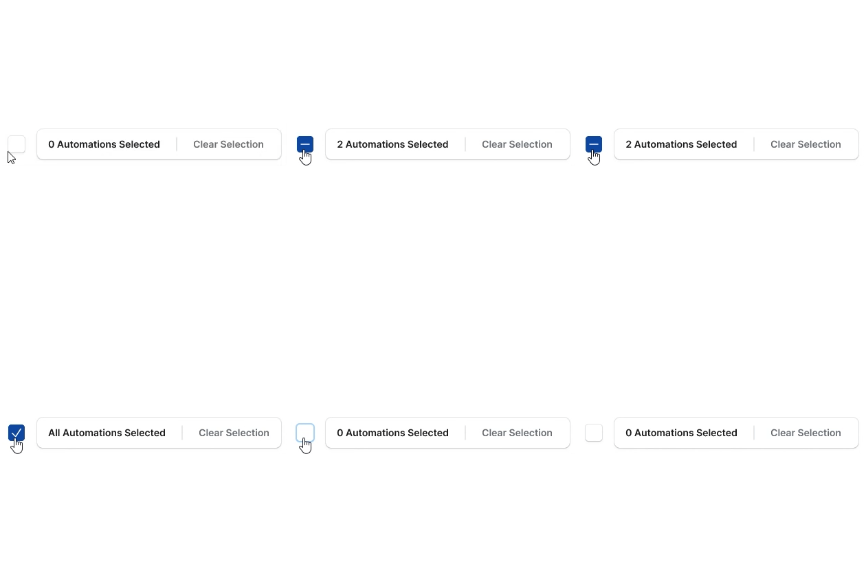
5.4 Checkbox interactionAutomation setup
Linear navigation
Scaffolding user learning.
Creating a user-friendly automation tools can be challenging, particularly when catering to users with varying levels of technical expertise.
We implemented a step-by-step design approach as shown in (Figure 6.0).
In this design, users are initally presented with a single clear action "A" and only upon completing step "A", does the subsequent action "B" becomes available.
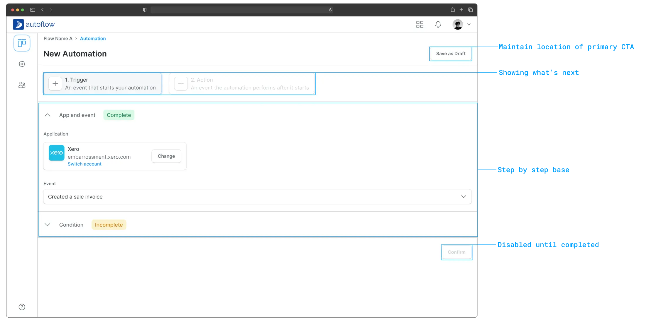
6.0 Automation setup layout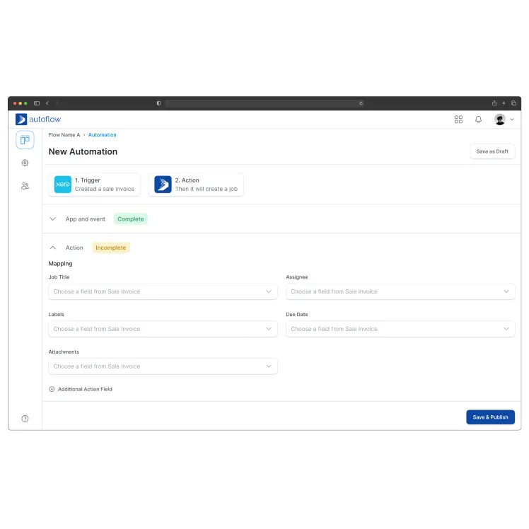
6.1 Action mapping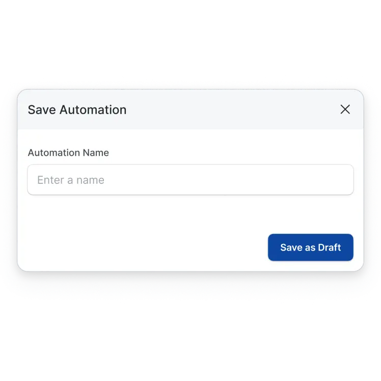
6.2 Save dialogEnhancing the task completion experience.
By presenting tasks in a clear, sequential manner, we leverage users' existing knowledge and ability to follow logical progressions.
Limiting the number of choices and actions presented at any given time minimizes user confusion and information overload
(Figure 6.3) demonstrably validated through positive user feedback.
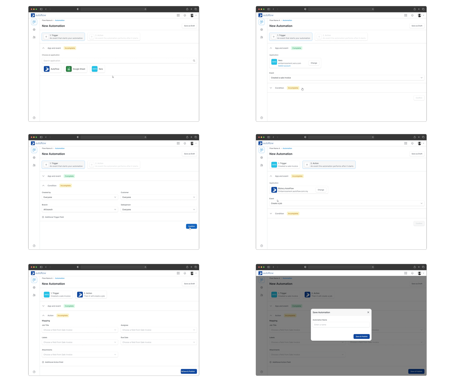
6.3 Automation setup interaction@embarrossment