To see full case study, click link below
PDF not available (coming soon)
Project Type
Professional
My Role
UI/UX Designer
Timeline & Status
2 Years, Launched on January 2024
Overview
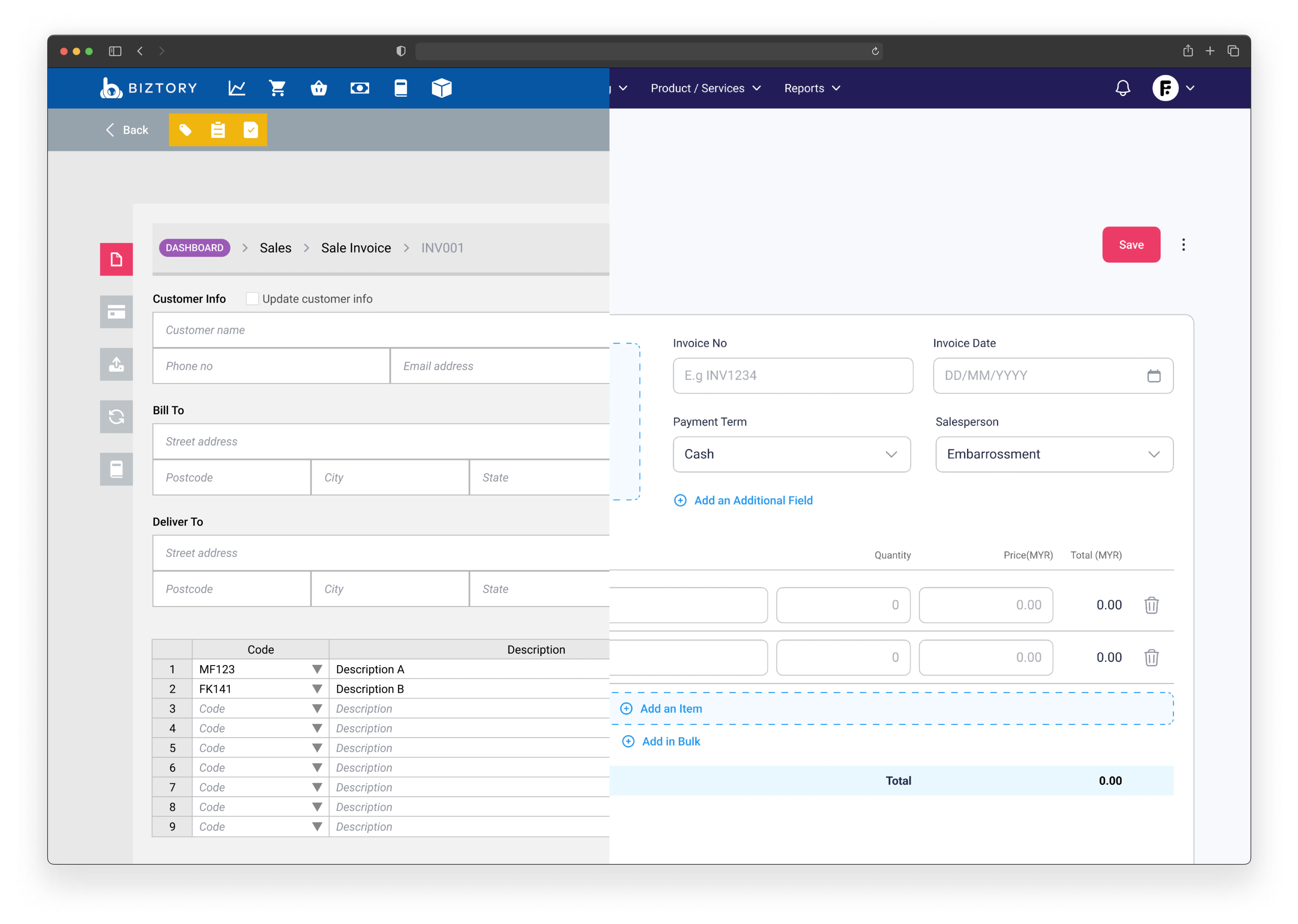
I was entrusted with the responsibility of overhauling the entire user interface (UI) for Biztory, where I played a pivotal role in the product design process.
The redesigned product is centered around optimizing business and financial management, with a particular focus on meeting the needs of small and medium enterprises (SMEs).
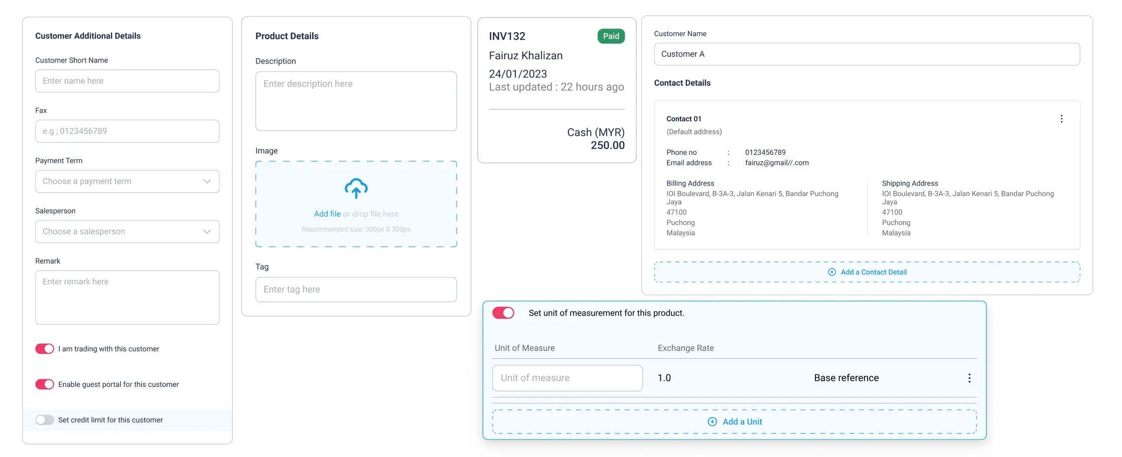
0.1 Sample UI components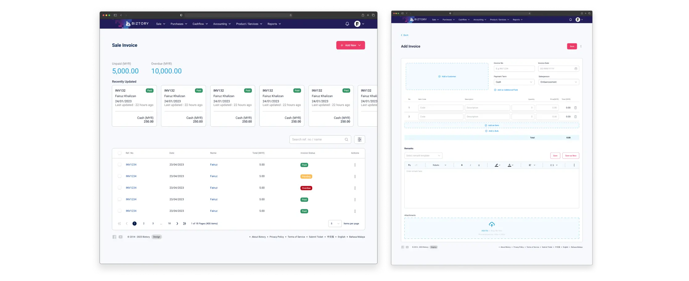
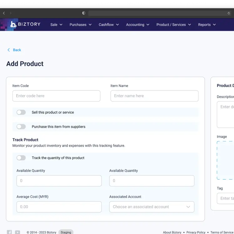
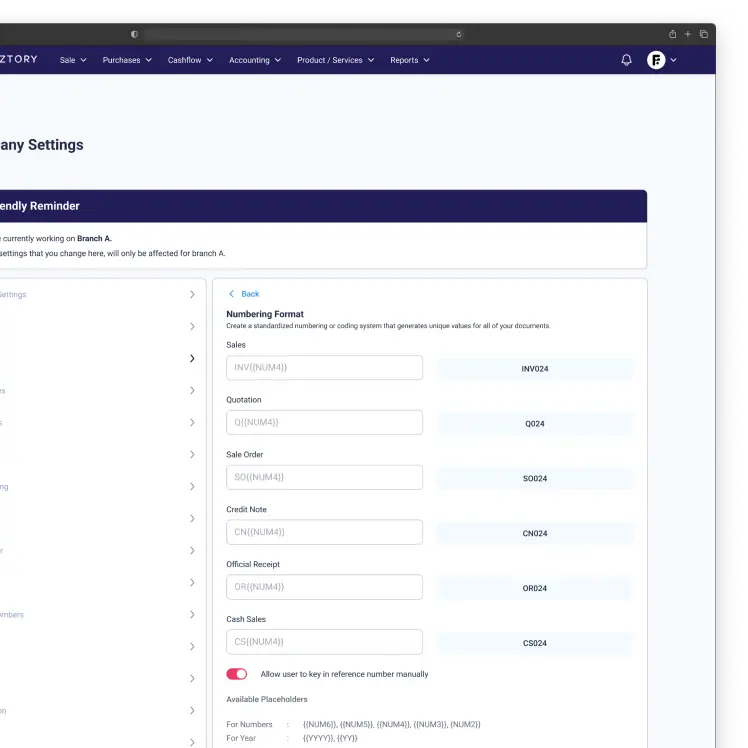
0.2 Desktop web page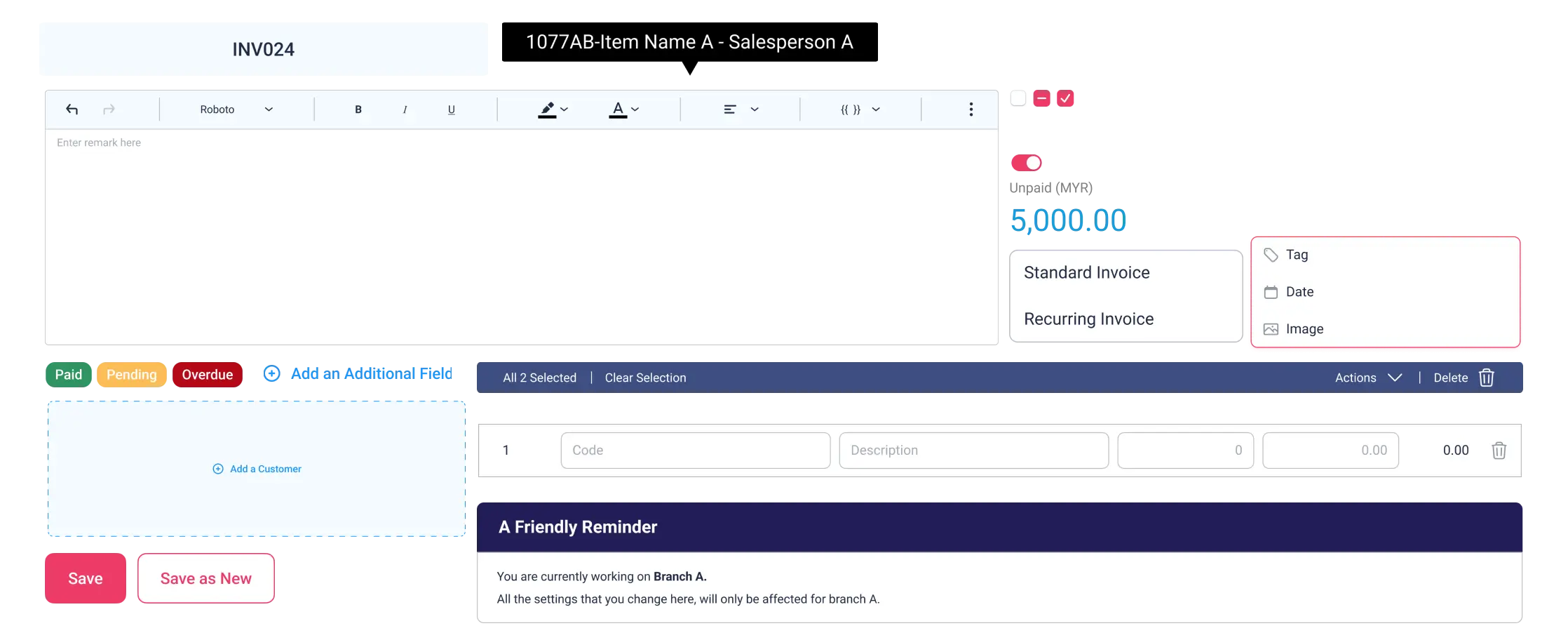
0.3 UI core componentsContext
A contemporary approach to UI design.
The need to enhance design to stay competitive.
The growing development of financial management tools has heightened product competition, requiring us to stay aligned with market trends, particularly with the increasing demand for clean, modern design, in order to remain relevant.
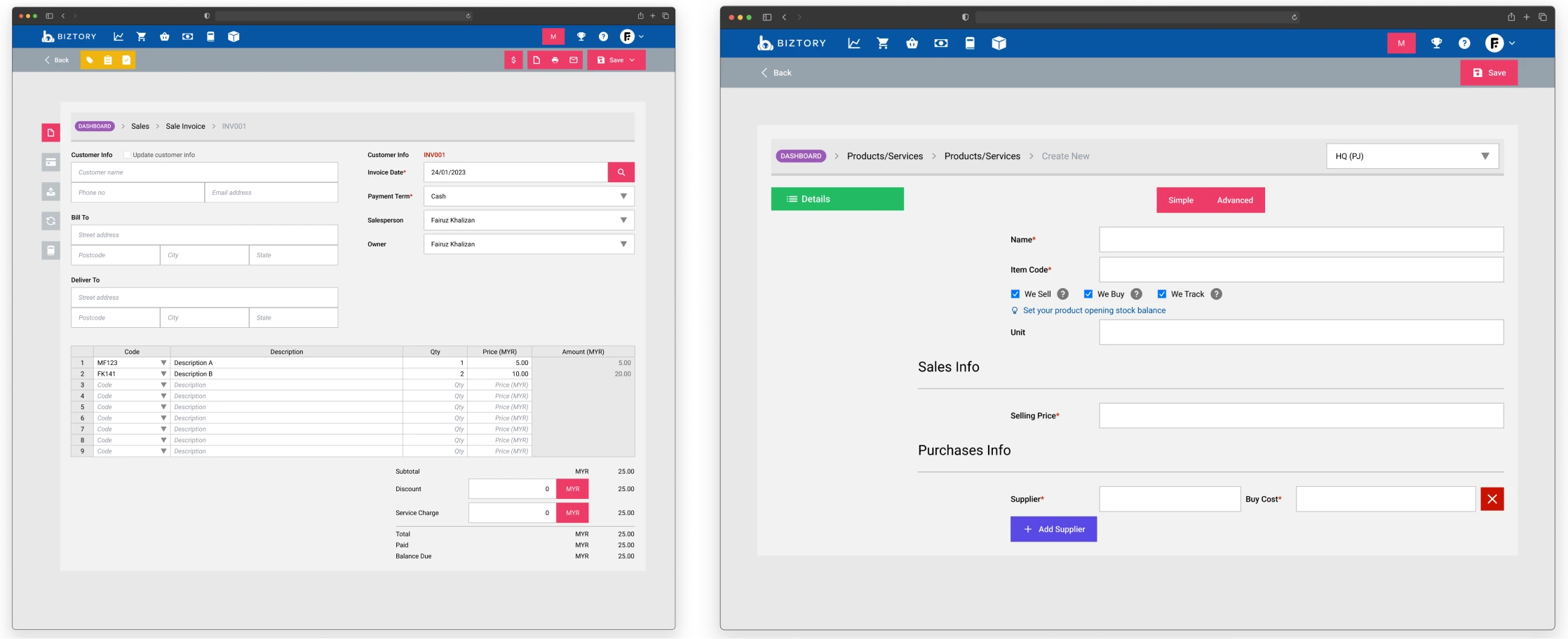
1.0 Biztory's old screensProblem
A barrier to product evolution.
A necessity for relevance.
The previous design posed significant challenges, marked by both aesthetic deficiencies and a lack of intuitiveness that hindered user experience.
Consequently, the existing user base has increasingly migrated to competitor products that offer a more modern look and feel, underscoring the need for a design overhaul to enhance competitiveness.
Competing products with modern UIs can overshadow an outdated design.
A perception of stagnation and neglect, diminishing credibility and trust among users.
Not support advanced features or technologies.
Hinder the adoption of new design trends and technologies, preventing the product from evolving.
Challenge
Milestones and feature release schedule.
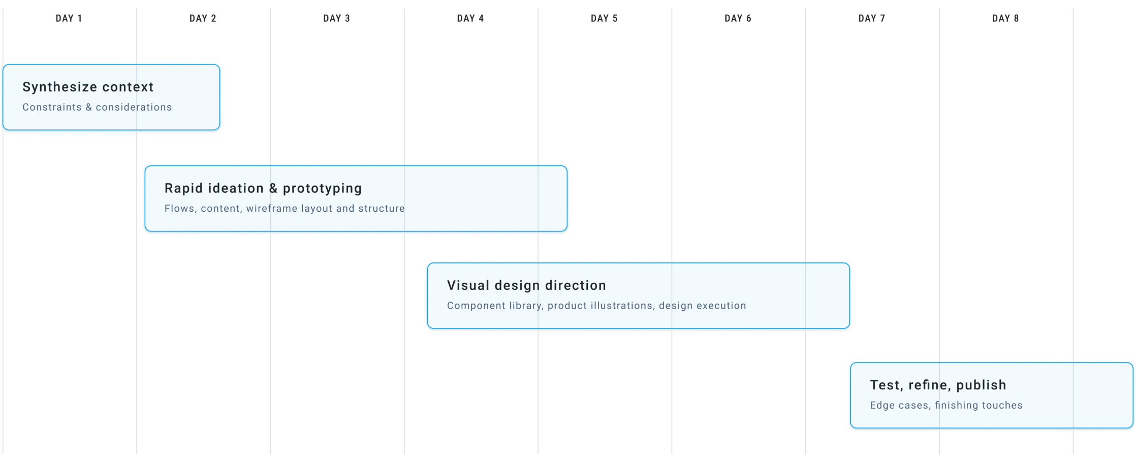
2.0 Average sprint timeline per featureFlow
The default operational structure.
Understanding sales and invoicing practices.
Before initiating the design process, it is crucial to thoroughly understand invoicing practices, particularly for small businesses, as their specific workflows and constraints shape how they manage financial tasks.
This insight allows us to design a user flow that aligns with their operational needs, ensuring an intuitive, seamless experience from a UX perspective.
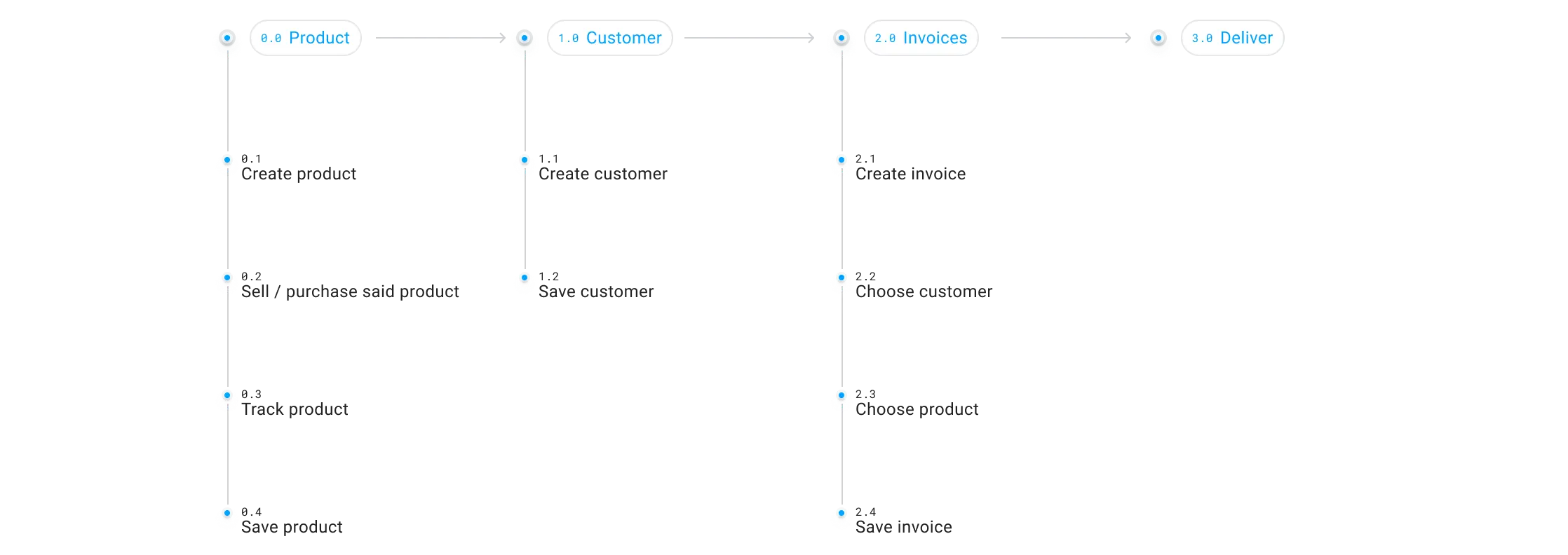
3.0 Standard practice flowProduct
Clarifying the purpose.
Designing intuitive product forms.
In designing product forms, it is essential that the structure be intuitive and easily understood by the user, regardless of the whether they are purchasing or selling the product.
To achieve this, the design should follow a parent-child structure, where each category or function of the product is clearly defined, ensuring they can quickly identify their product's role and manage it effectively within their business operations.
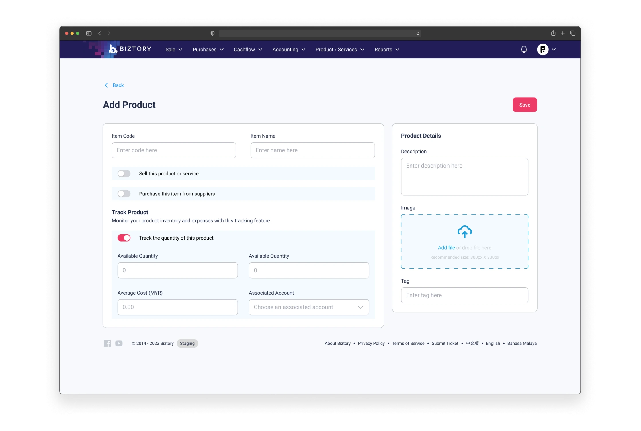
4.0 Product formThe old and the new.
The old UI for the product form lacked a hierarchical layout, making it difficult for users to navigate and understand the distinct functions—such as purchasing, selling, or tracking—due to the absence of clear organization, which is essential for guiding users intuitively through complex tasks.
The new UI solves the previous issue of poor hierarchy by introducing a structured layout that improves user navigation, while also offering flexibility for future feature expansion, ensuring that new functions can be seamlessly integrated without disrupting the overall user experience.
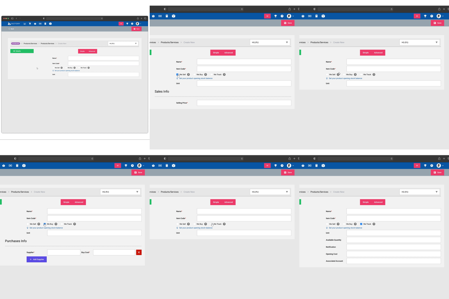
4.1 Old product formThe absence of a clear structure made it difficult for users to understand the relationships between different sections and functions.
The old design didn’t easily accommodate new features or updates, making it difficult to expand without further complicating the interface.
Without a logical layout, the form appeared disorganized and overwhelming to users.
Users found it hard to follow a clear workflow, leading to frustration and errors in usage.
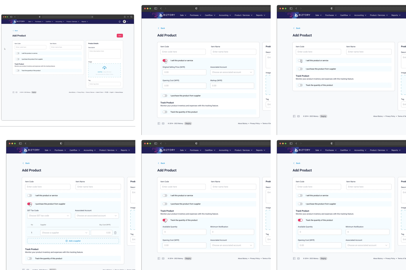
4.2 New product formThe new UI organizes functions in a logical, parent-child layout, making it easy for users to navigate and understand each feature's purpose.
The flexible design allows for seamless integration of new features without disrupting the existing interface or user experience.
The structured layout enhances user flow, allowing for faster and more efficient access to key functions.
Customer
Crafting forms to create enduring customer bonds.
Forms that connect.
To create a customer form that fosters long-term relationships, designers must move beyond the basic transactional approach, focusing instead on personalization, simplicity, and clarity to ensure a user-friendly experience.
Incorporating features such as data transparency, feedback options, and ongoing support transforms the form into a meaningful touchpoint that builds trust and strengthens customer engagement over time.
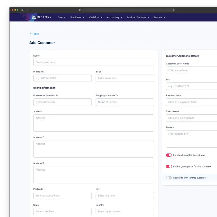
5.0 Customer formRedesigning for connection.
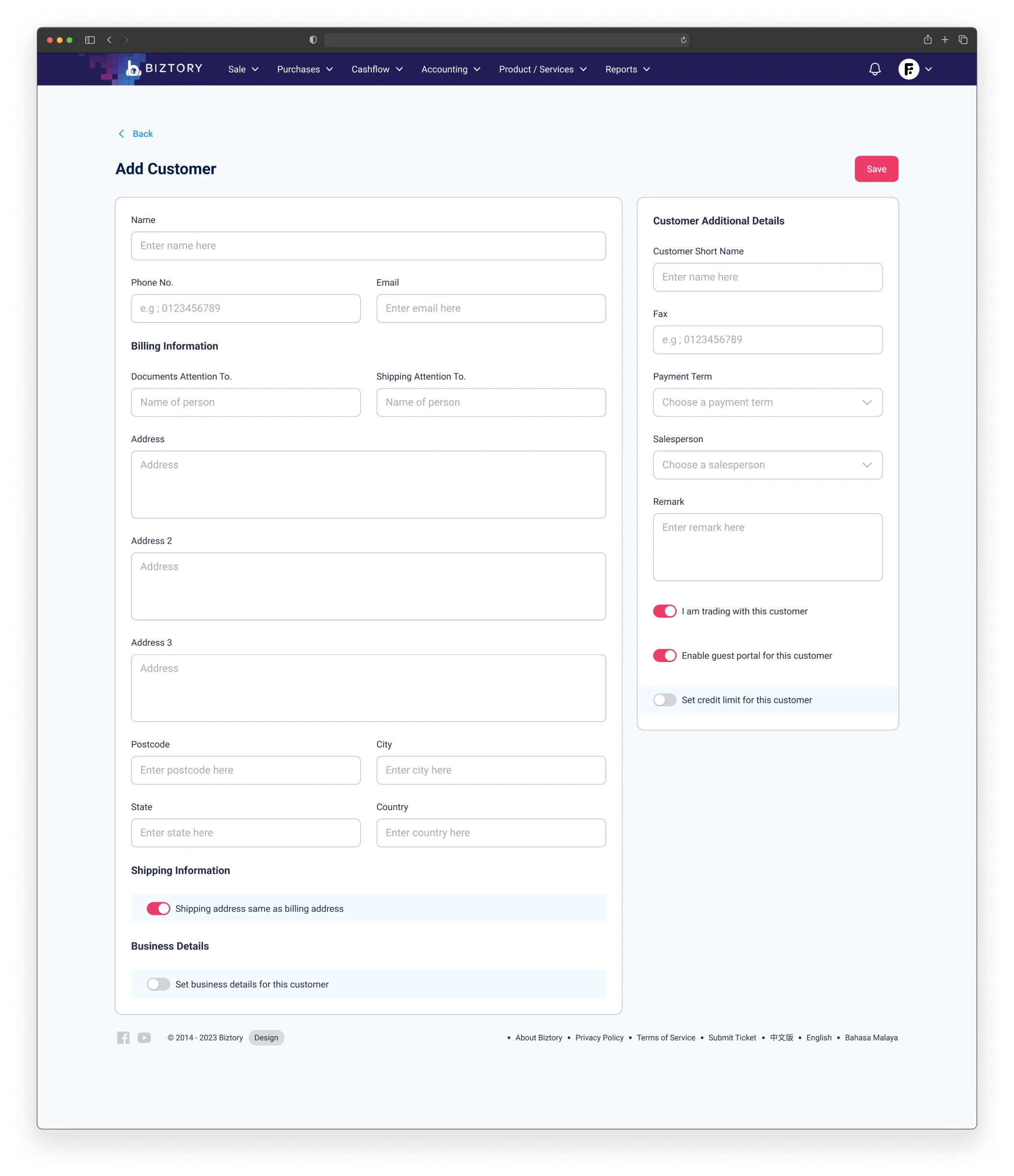
The old form, primarily focused on data collection, lacked a structured layout, making it difficult for users to navigate and understand the form’s functions, which led to disengagement and frustration.
The new form, however, introduces a hierarchical, user-centered design that enhances usability by providing clear guidance through each step, incorporating personalization and responsive design for mobile users, and ensuring that users can easily complete tasks.
This improved structure not only simplifies interactions but also fosters stronger, more meaningful customer relationships by creating an intuitive, engaging experience that builds trust and supports long-term business growth.
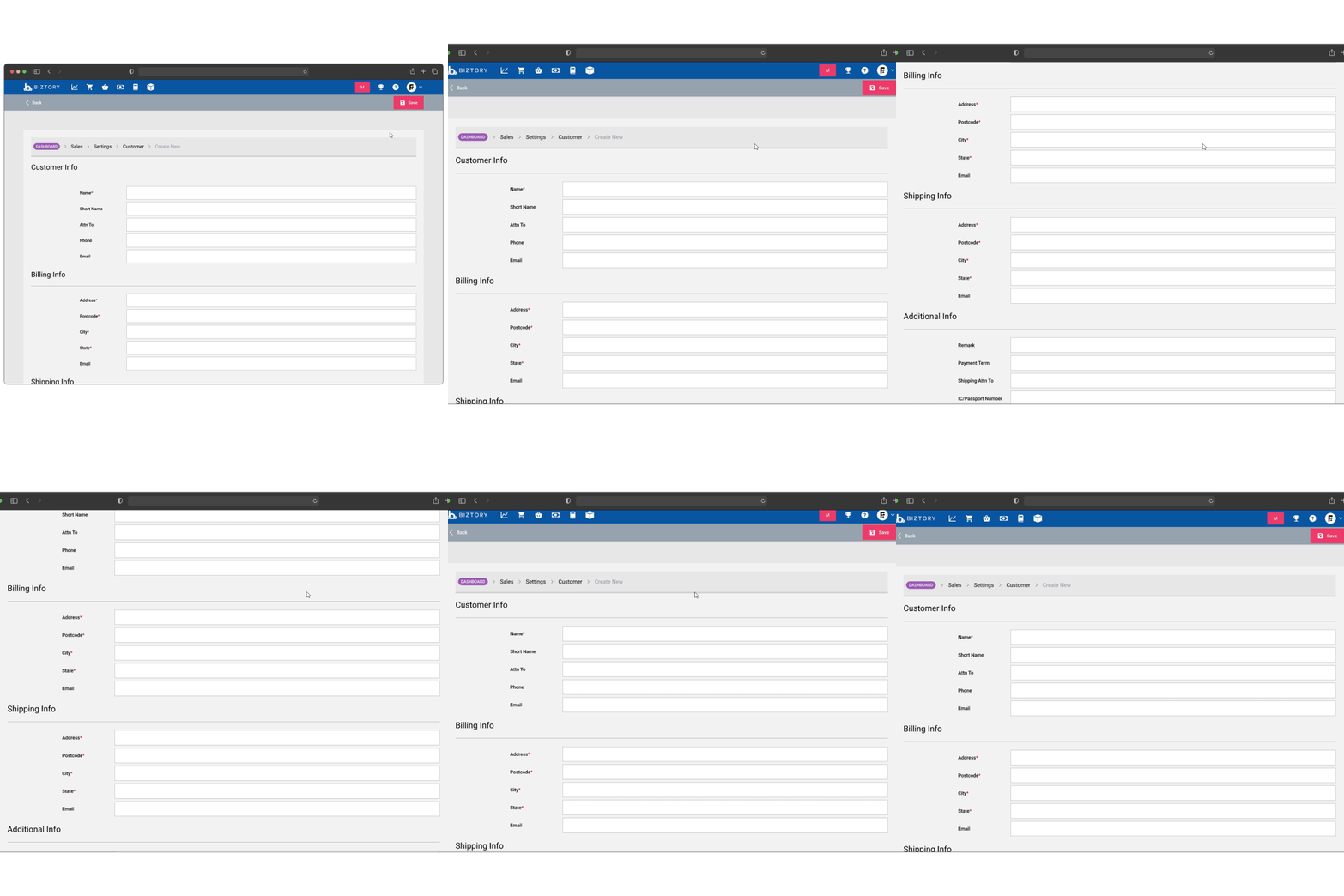
5.1 Old customer formThe form didn't adapt to individual user needs, creating a one-size-fits-all experience that felt impersonal.
The form was transactional, offering no features to engage users or foster ongoing interaction.
Adding new features or adapting to user feedback was challenging without disrupting the form's layout.
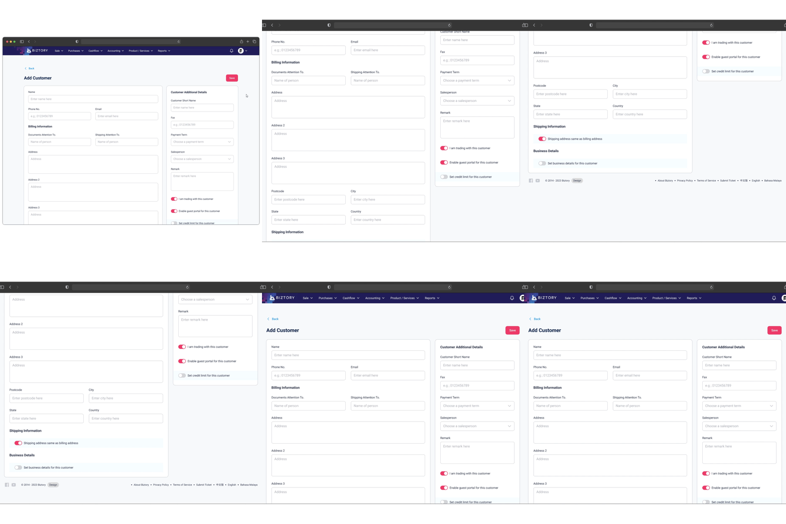
5.2 New customer formNew features can be integrated into the form without disrupting the overall layout, allowing for future expansions.
The design is modern, clean, and visually appealing, enhancing user trust and satisfaction.
Invoices
The future of flexible billing.
Designing invoices that grow with your business.
Designing intuitive invoices with a modular and adaptable structure enhances usability by breaking down the form into distinct, customizable components allowing businesses to easily modify or expand sections as needed without disrupting the overall layout.
This adaptability ensures scalability, enabling businesses to integrate new features, comply with changing regulations, and improve workflow efficiency, while the intuitive design reduces user errors and creates a more seamless, user-friendly billing experience.
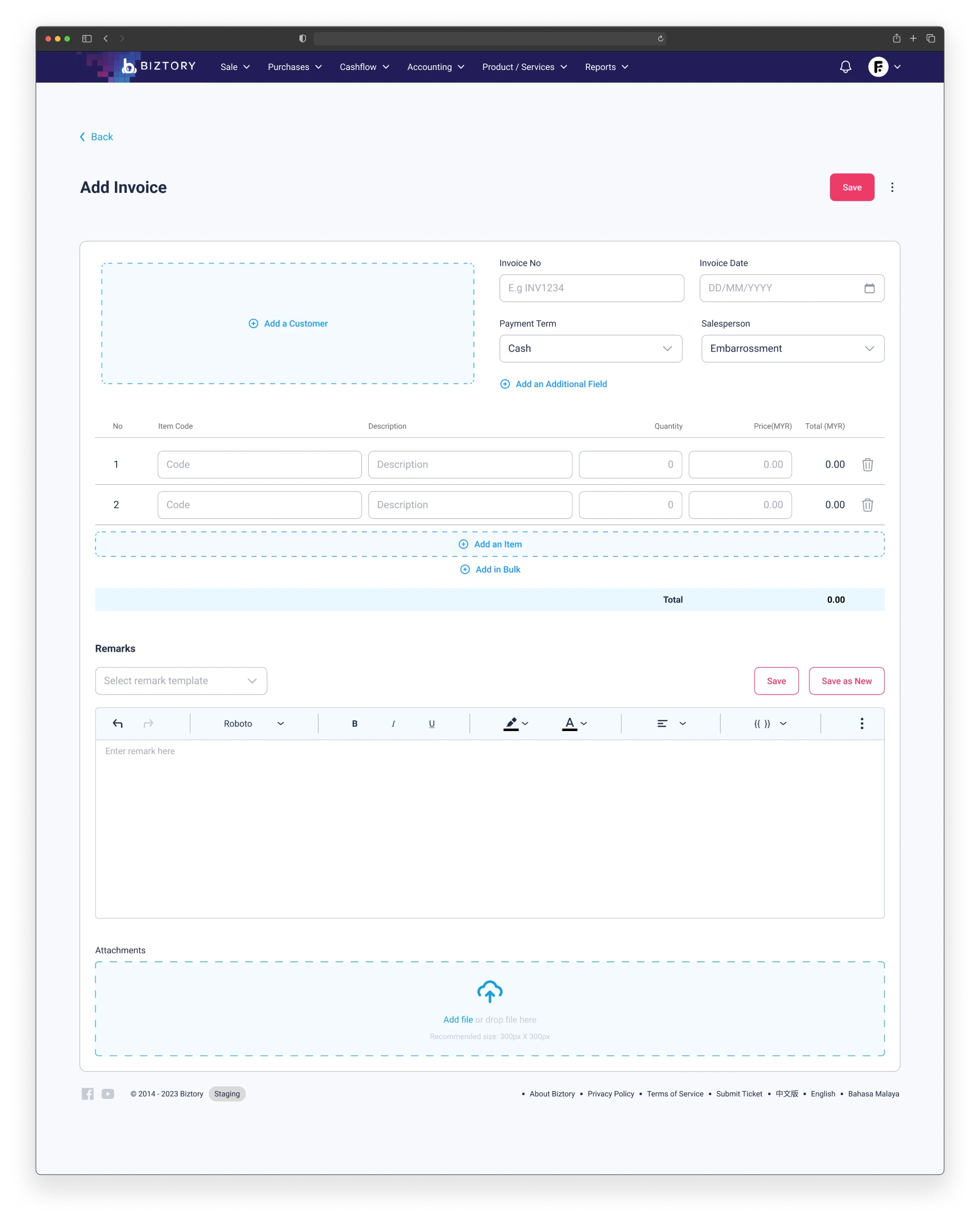
6.0 Invoice formFrom limited to scalable.
The old invoice form was rigid and limited, separating related features across different pages, which made managing invoices difficult and hindered scalability. Its design lacked flexibility, preventing easy integration of new features and restricting its overall use case.
In contrast, the newer invoice form is built with a modular, adaptable structure, allowing for seamless expansion as business needs evolve.
By consolidating features into a unified layout and making them easily accessible, the new form enhances usability, simplifies navigation, and supports future growth.
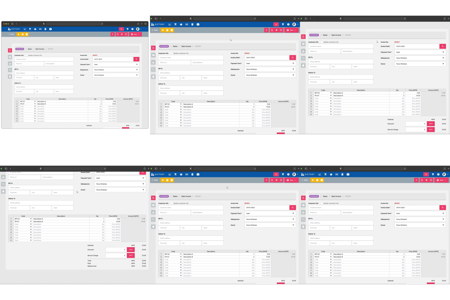
6.1 Old invoice formDifferent features were separated across multiple pages, making it confusing and inefficient to manage invoices.
Important features were not easily accessible, requiring extra steps to find them, which hampered efficiency.
The form was rigid and difficult to modify or expand with new features as business needs grew.
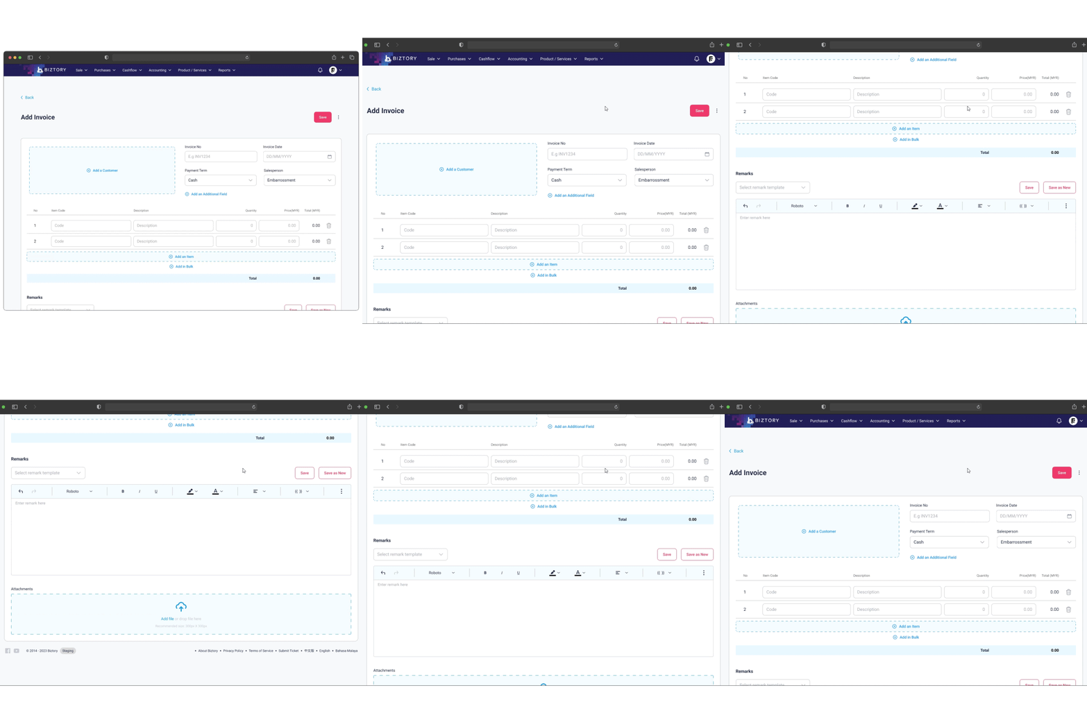
6.2 New invoice formAll features are accessible within a unified layout, reducing the need for switching between different pages.
Key features are no longer hidden, making them obvious and easy to use, which enhances workflow speed.
The form is built with a modular structure, allowing for easy customization and updates without overhauling the entire system.
Listing
Prioritizing information.
Data that matters.
To design effective listing pages, it's critical to first identify the specific information that users need to access quickly.
A user-centric approach to table design helps streamline navigation, enabling users to quickly find and act on essential data without being overwhelmed by unnecessary details.
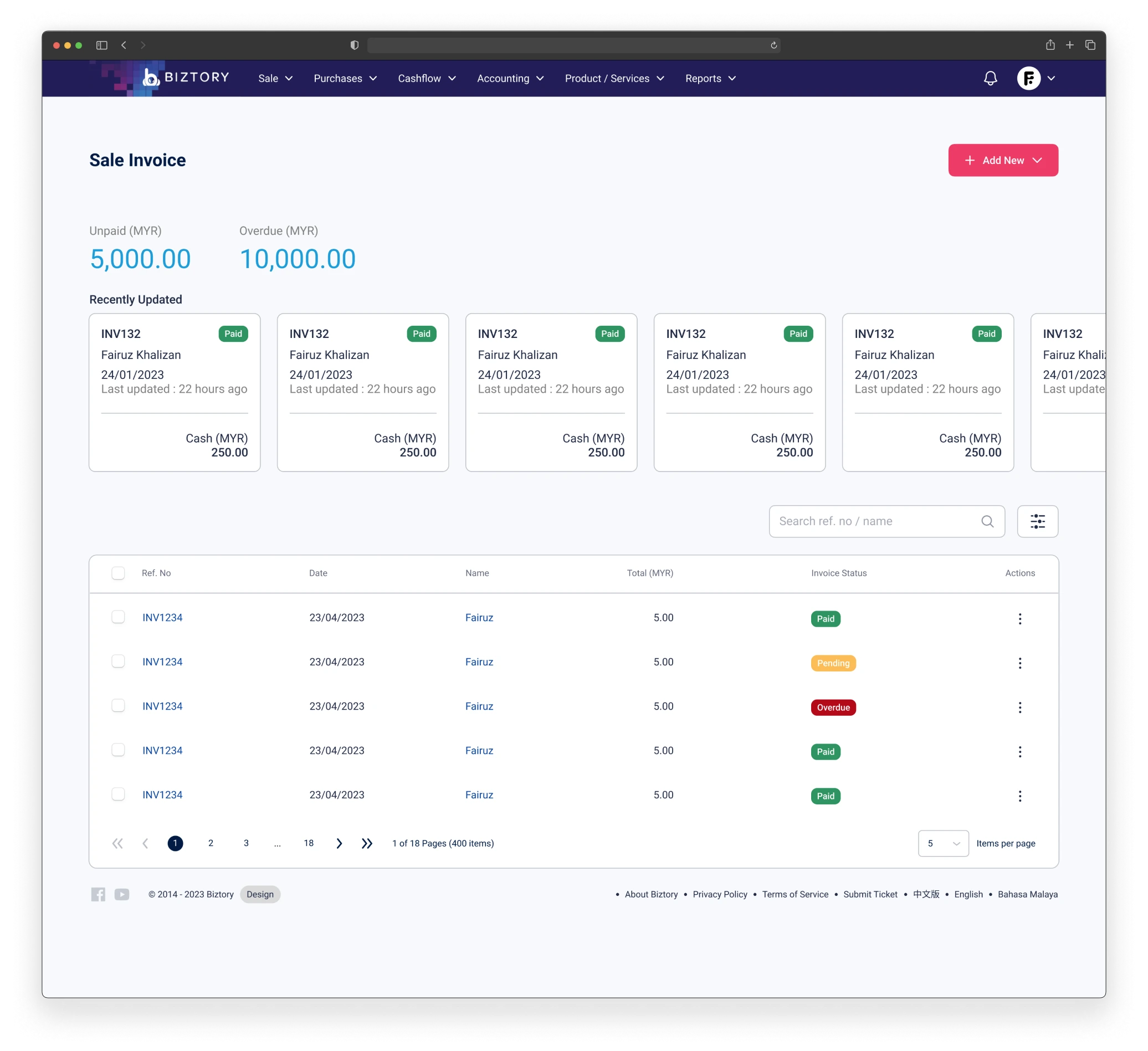
7.0 Listing invoice pageNavigability and data prioritization.
The old listing page design struggled with two key issues: a lack of focus on displaying essential information and poor navigability.
Important data was not highlighted, causing users to waste time searching for relevant details within a cluttered interface.
Furthermore, the page offered only a limited number of actions, restricting its functionality and scalability, making it difficult for users to manage larger datasets or perform more complex tasks.
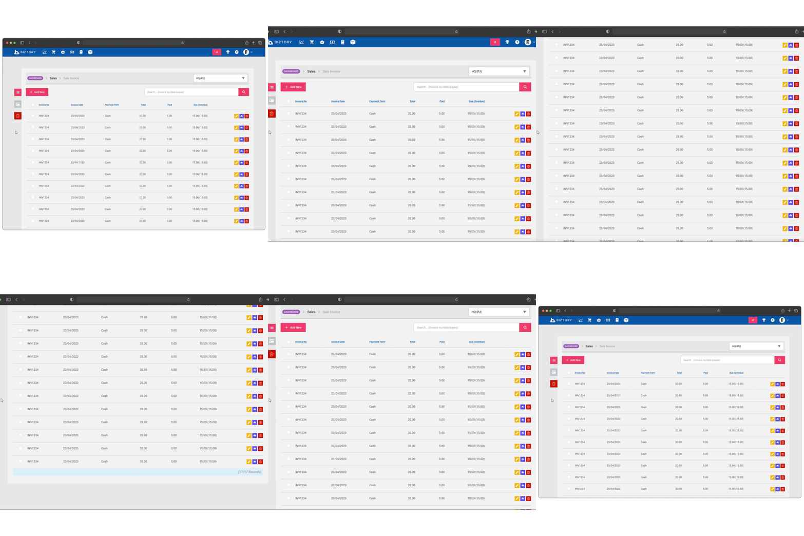
7.1 Old invoice listingLimited set of actions, restricting users' ability to perform various tasks effectively.
The visual design of the page may have felt stale or unappealing, potentially detracting from the user experience.
Do not offer sufficient options for filtering or sorting invoices, making it challenging for users to find specific entries.
Important invoice details were not prioritized or clearly displayed, leading to inefficiencies in accessing crucial information.
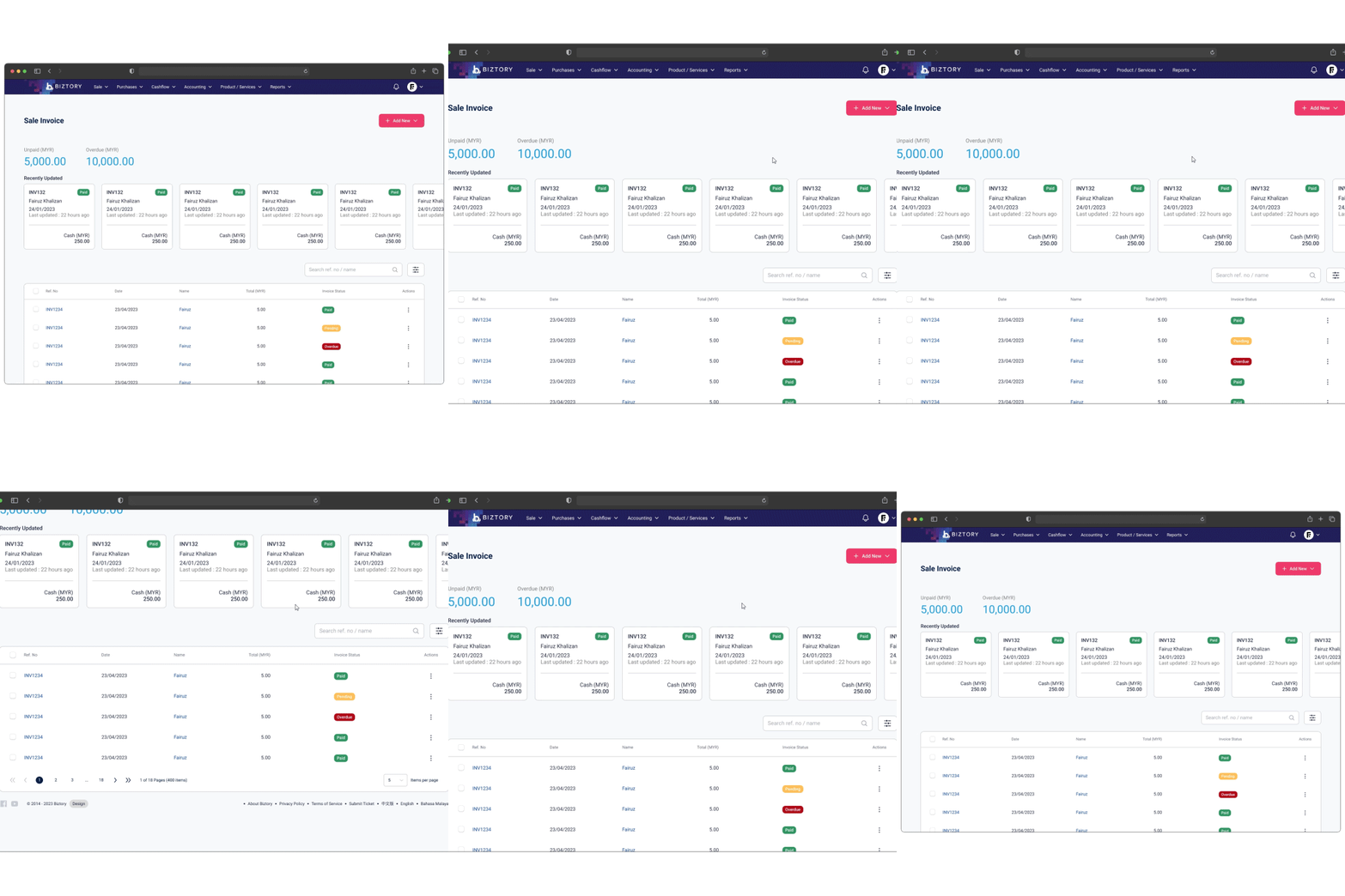
7.2 New invoice listingIncludes a wider range of actions, allowing users to edit, delete, or manage invoices efficiently based on their specific needs.
The clear presentation of information minimizes confusion, making it easier for users to process and understand the data presented.
Key invoice details are prominently displayed, ensuring users can access critical information at a glance, which facilitates quicker decision-making.
Screens
The overhaul.
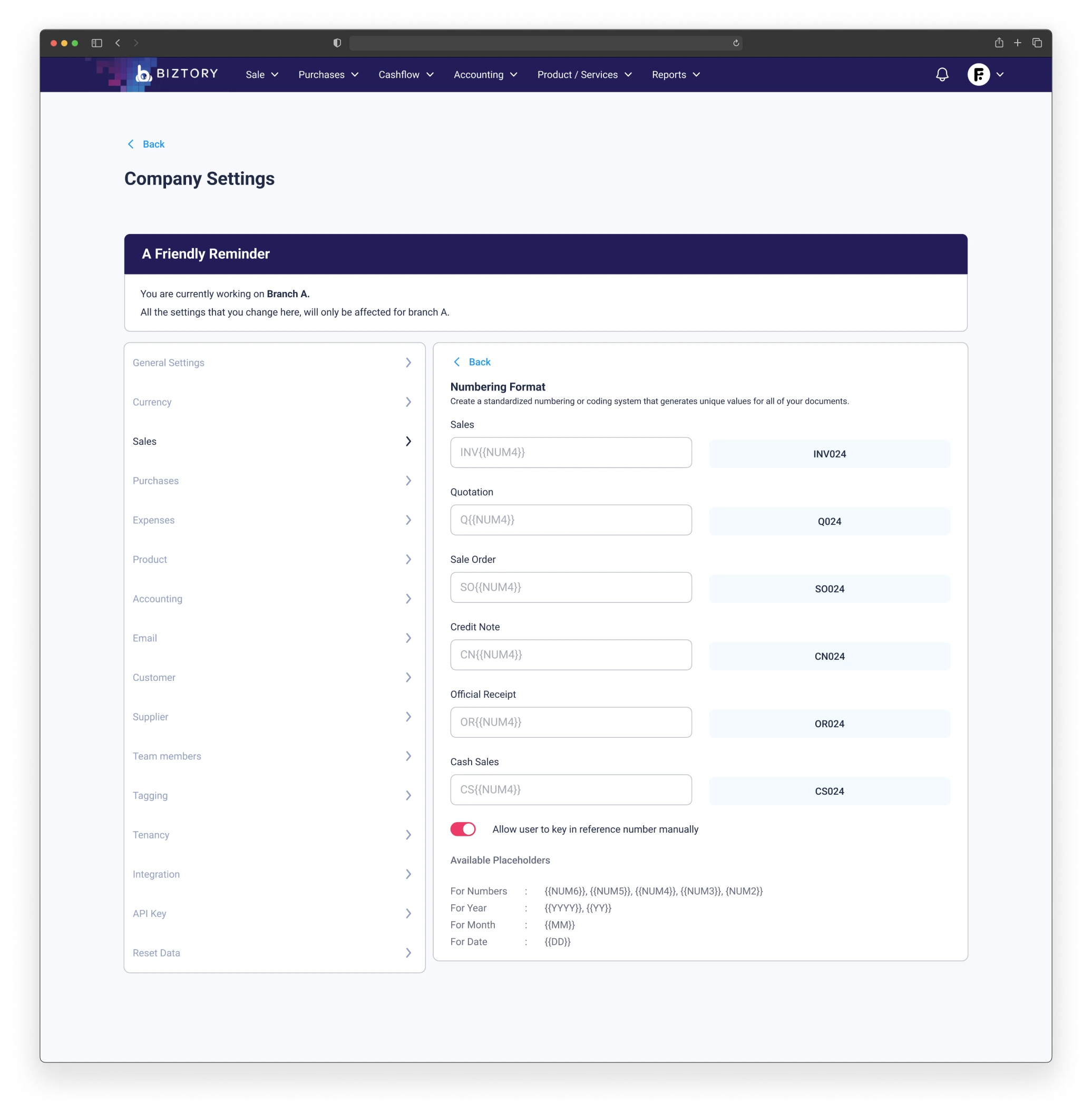
8.0 Company setting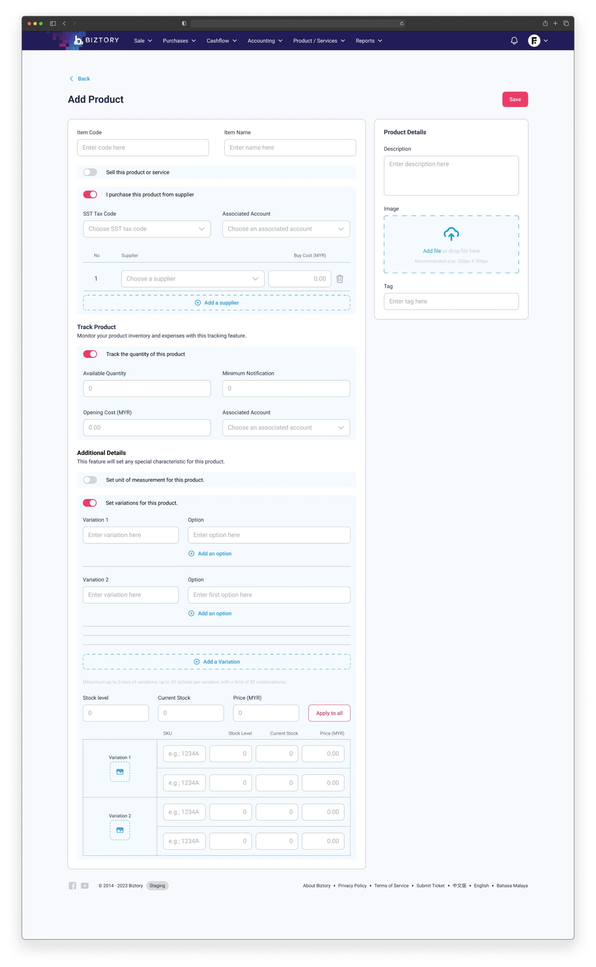
8.1 Product form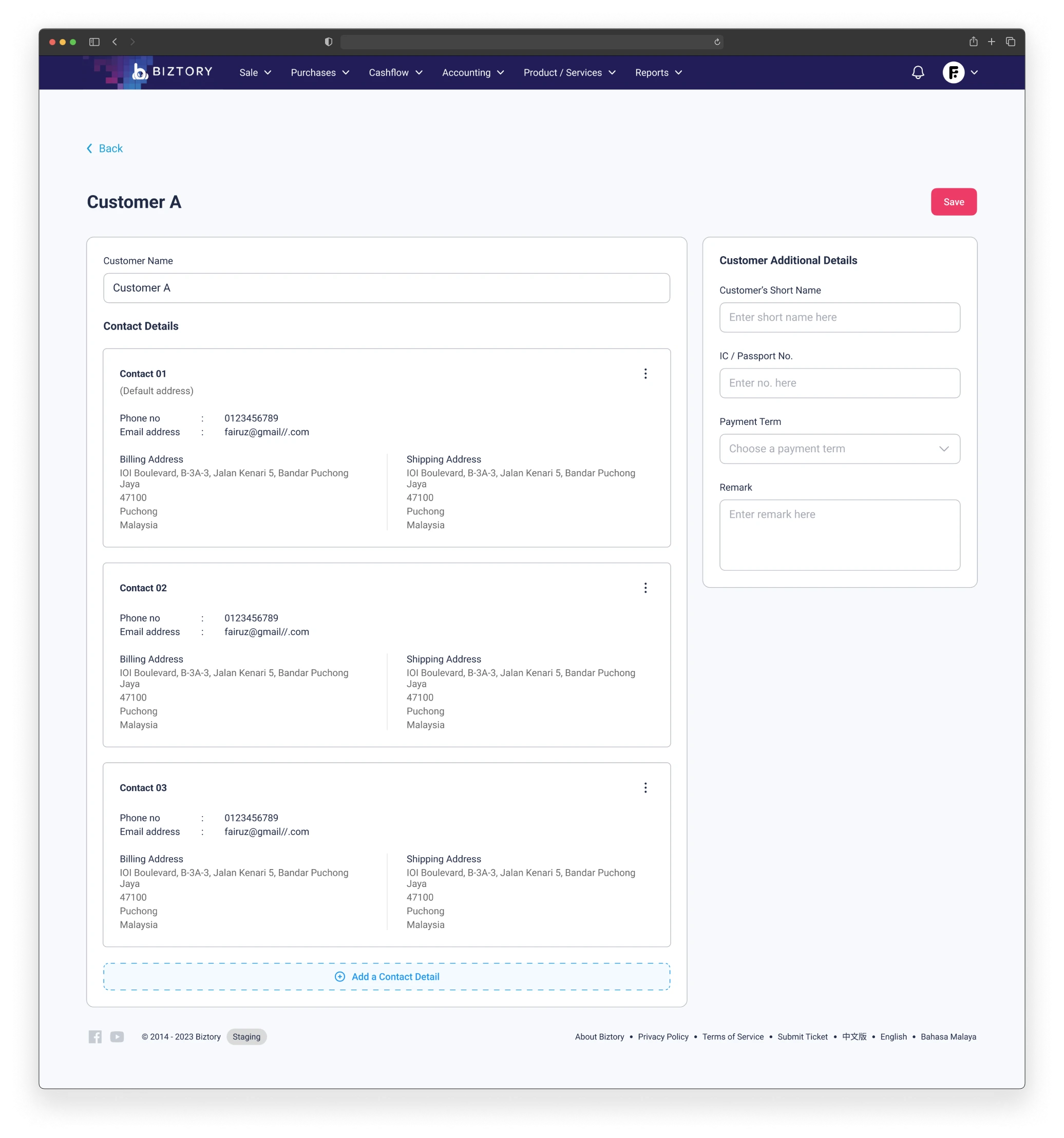
8.2 Customer contact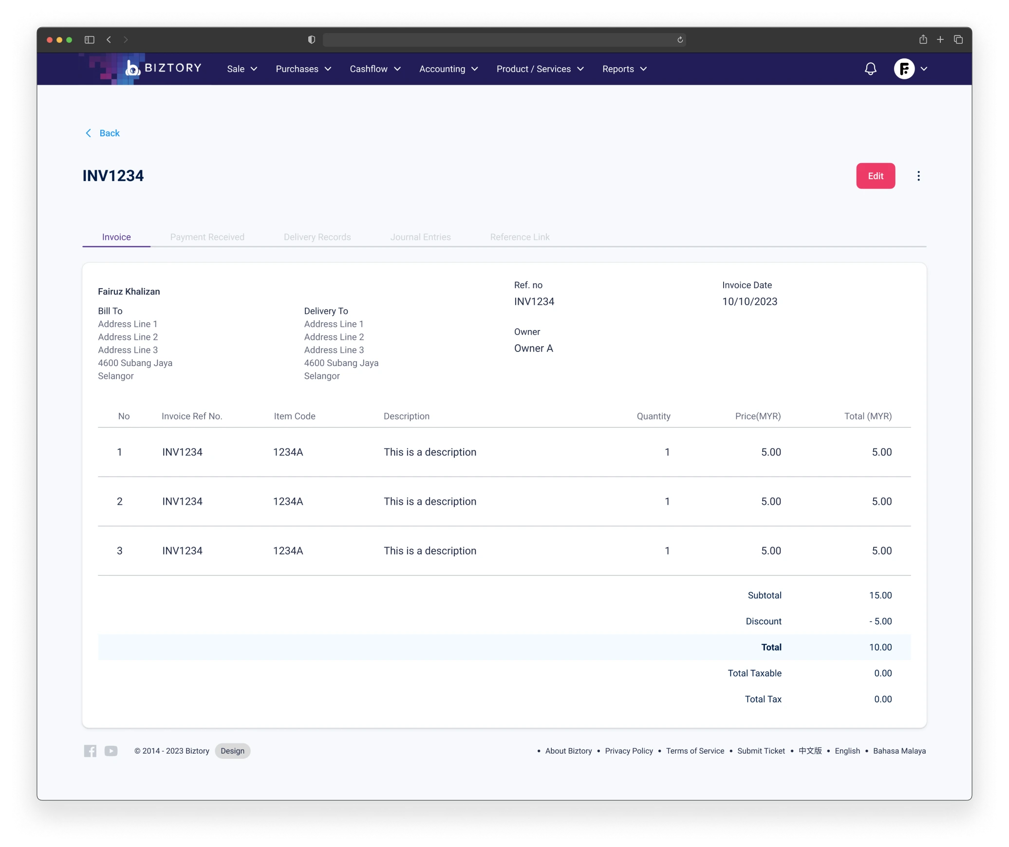
8.3 Invoice view@embarrossment